A masonry layout packs cards of different heights into equal-width columns with no gaps, like the feed on Pinterest. Bringing this kind of layout into a web page requires more considerations than it may seem, which makes it surprisingly difficult. Anyone who has built one has probably run into that difficulty. Anyone who has not can use this article to get a sense of where the complexity comes from.
Starting with Safari 26.4, this challenging layout can be built with CSS alone by using the display: grid-lanes layout mode.
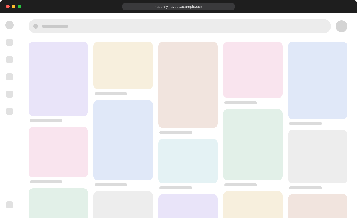
Example masonry layout
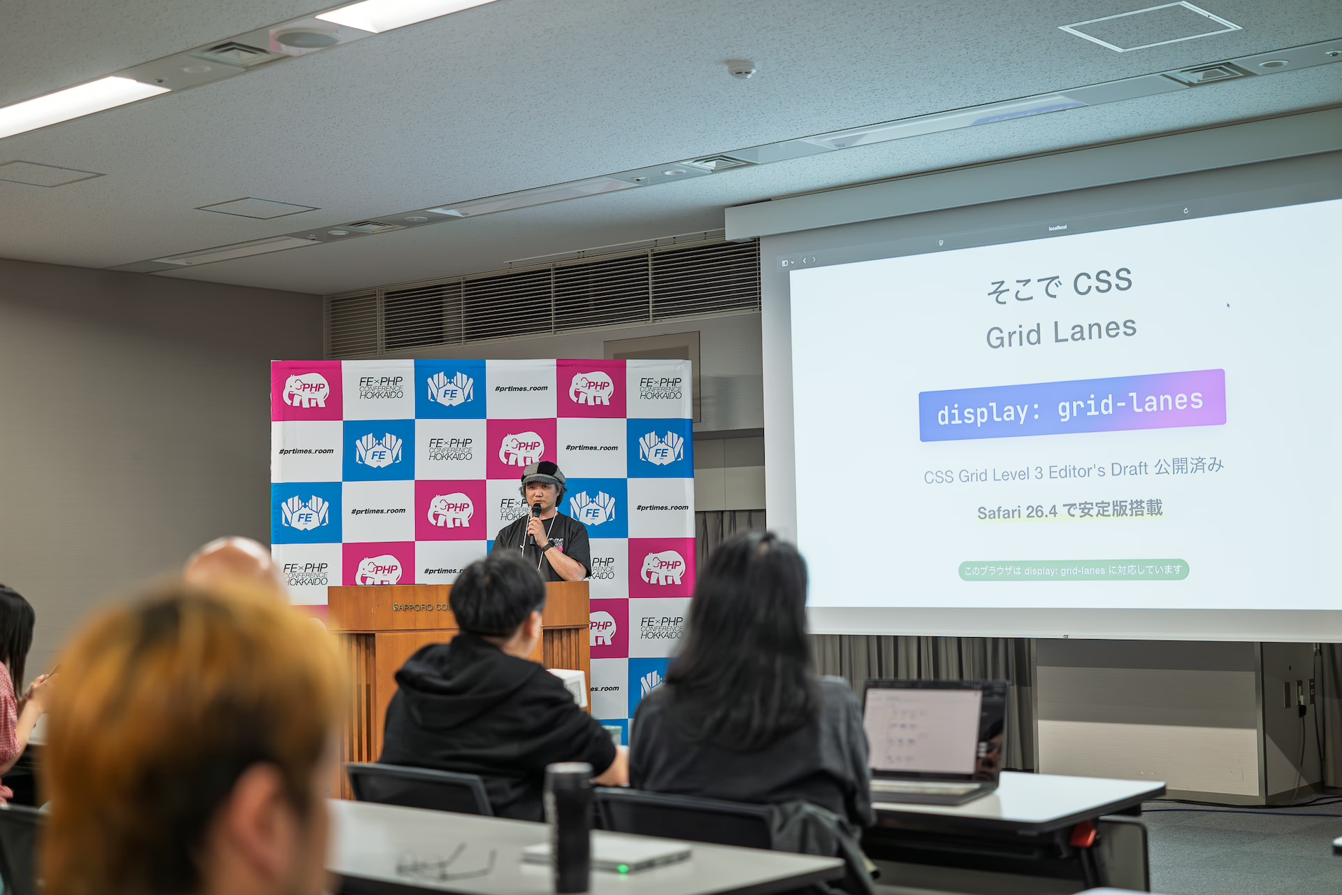
This article is based on a talk titled “CSS Grid Level 3 grid lanes demo and the future of web standards,” presented at Frontend PHP Conference Hokkaido 2026 on June 6, 2026.
Why masonry has been difficult in CSS
In this article, a layout that packs cards of different heights into equal-width columns with no gaps is called “masonry,” and the CSS feature that enables it is written as display: grid-lanes.
What masonry needs can be reduced to three requirements.
- Card heights are variable because they depend on image sizes and text length.
- Columns are equal width, and the number of columns changes with the viewport width.
- Cards are packed into the next available column with no gaps while preserving their HTML source order.
Earlier CSS layout modes did not provide a way to “find the shortest column and place the next item there.” CSS Grid and Flexbox are good at aligning items to rows and columns, but they do not handle this kind of asymmetric packing where each column grows to a different height.
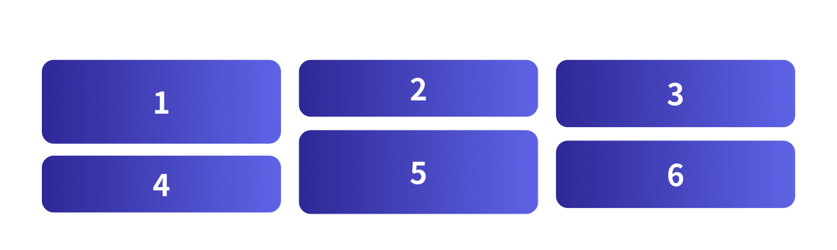
In the diagram below, cards 1 to 6 are taken in HTML source order, and each card is placed into the column that is currently the shortest.
Previous workarounds and their limits
Until now, three broad workarounds have been commonly used.
| Workaround | Examples | Limitations |
|---|---|---|
| JavaScript masonry | masonry.js, Isotope, and similar libraries | JavaScript needs to recalculate positions on resize and when items are added, which can cause jank. It also has drawbacks for SSR and maintenance. |
| CSS Columns (multi-column layout) | column-* properties |
The tab order runs vertically by column, which creates a poor screen reader experience. |
| Splitting columns with Flexbox | Flexbox plus column containers | You need to manage height balancing between columns yourself. |
display: grid-lanes
With display: grid-lanes, masonry can be implemented as a dedicated layout mode.
.lanes {
  display: grid-lanes;
  grid-template-columns: repeat(auto-fill, minmax(144px, 1fr));
  gap: 10px;
}
The first two lines are all that is needed for masonry. display: grid-lanes switches the layout mode, and grid-template-columns defines the columns, or lanes. Together, they create responsive masonry without media queries. The third line, gap, sets the space between cards. This is the pattern you will use most often.
grid-template-columnsbecomes the vertical layout definition, selecting vertical stacking, described later as waterfall.minmax(144px, 1fr)sets the minimum column width, 144px, and the flexible range,1fr.auto-fillincreases the number of columns as long as they fit.
The demo below lets you change the container width with a slider. As the container becomes narrower, the number of columns automatically decreases without media queries.
The demos in this article require Safari 26.4 or later.
The fill algorithm: lanes grow independently
grid-lanes behaves as follows.
Place the next card into the shortest column. Repeat until all cards have been placed.
Normal CSS Grid places items on cells defined by row and column grid lines. In grid-lanes, each column is independent as a lane, and each lane has a current running position that indicates how far it has been filled. On each placement, the lane with the earliest running position, meaning the shortest column, is selected.
Step by step, the process is as follows.
- Check the current height of each column, or lane.
- Place the next card into the shortest column.
- Repeat until the last card is placed.
For example, placing cards 1 to 6 into three columns works like this.
- 1, 2, and 3 are first placed at the top of each column in order.
- 4: columns 2 and 3 have the same height and are the shortest. When heights are tied, the earlier lane, on the left, is chosen, so card 4 goes into column 2.
- 5: now only column 3 is the shortest, so card 5 goes into column 3.
- 6: column 1 is left; it was taller at first, but the other columns have since filled up.
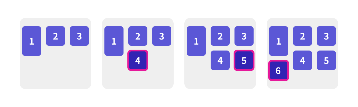
The result looks similar to ordinary Grid at first glance, but the decisive difference is that rows are not aligned; each lane grows independently.
Switching direction: waterfall and brick
The stacking direction of grid-lanes is determined automatically by whether you specify grid-template-columns or grid-template-rows.
/* waterfall = vertical masonry (define columns) */
.lanes {
  display: grid-lanes;
  grid-template-columns: repeat(3, 1fr);
  gap: 8px;
}

/* brick = horizontal masonry (define rows) */
.lanes {
  display: grid-lanes;
  grid-template-rows: repeat(3, 96px);
  gap: 8px;
}
- waterfall, or vertical stacking: specify
grid-template-columns. This is the common vertical masonry layout. - brick, or horizontal stacking: specify
grid-template-rows. Items flow from left to right, like bricks in a wall. The row height is defined by row tracks, and each card has its own width. In the demo, the widths are intentionally varied.
The brick direction works well with RTL, right-to-left, text and with horizontally scrolling carousels. Because the direction changes simply by switching between column definitions and row definitions, it can also be combined with media queries to switch between vertical and horizontal layouts.
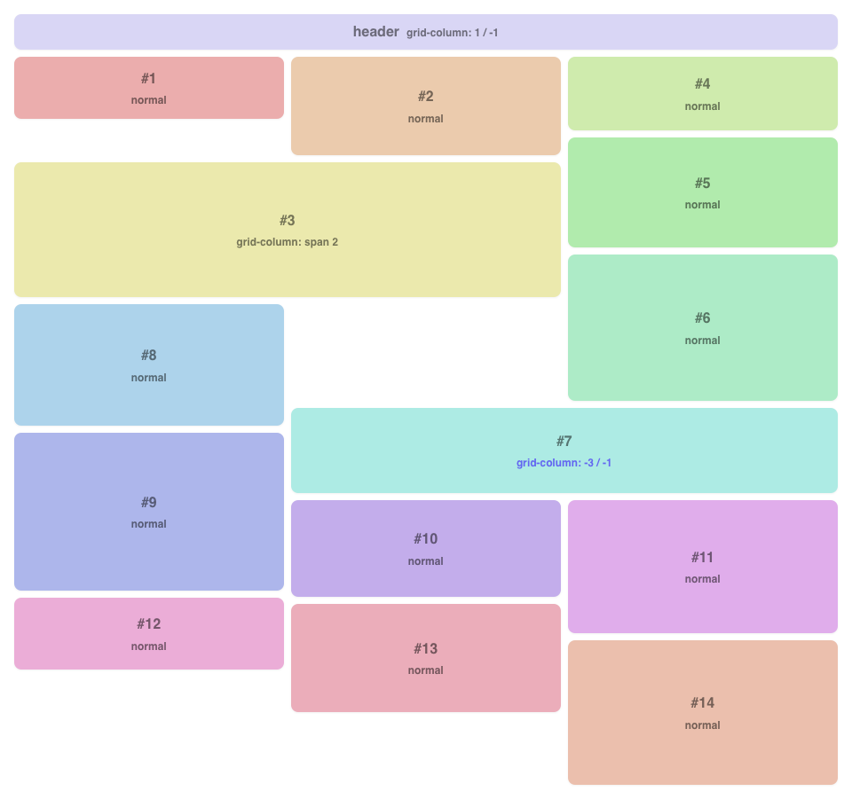
Item spanning and explicit placement
With grid-lanes, item width can be expanded using the same syntax as CSS Grid. For example, you can make only certain items wider.
.lanes {
  display: grid-lanes;
  grid-template-columns: repeat(3, minmax(0, 1fr));
}
header {
  grid-column: 1 / -1;
} /* full width */
.hero {
  grid-column: span 2;
} /* spans two columns */
.sidebar {
  grid-column: -3 / -1;
} /* right-aligned, spans two columns */
The header should span the full width, so it uses grid-column: 1 / -1. The .hero item uses grid-column: span 2 to span two columns. With negative indexes such as -3 / -1 on .sidebar, you can also align an item to the right edge.
When a wide item spans multiple lanes, it advances the running positions of all spanned lanes at the same time. In the example above, header spans all lanes from 1 to 3, so every other item is placed below header. This affects the flow-tolerance behavior described next.
Demo screenshot in Safari 26.4
flow-tolerance: lane snapping strength
flow-tolerance is a new property introduced together with grid-lanes. It specifies the tolerance used to treat lanes as having the same height.
.lanes {
  display: grid-lanes;
  grid-template-columns: repeat(auto-fill, minmax(min(144px, 30%), 1fr));
  flow-tolerance: 1em; /* The initial value normal is equivalent to 1em */
}
It accepts three types of values.
| Value | Behavior |
|---|---|
normal (initial value) |
Standard snapping with a tolerance of about 1em. |
<length-percentage> |
Explicitly specifies the tolerance, for example 0, 2em, or 10%. |
infinite |
Strictly preserves source order. It stops prioritizing the shortest lane and stacks items in DOM order. |
The fill algorithm places the next card into the shortest lane, but flow-tolerance controls how strictly the shortest lane is prioritized. If multiple lanes fall within the tolerance, they are treated as having the same height, allowing source order to take priority and keeping the visual order more natural.
- With a smaller
flow-tolerance, even tiny height differences cause the shortest lane to be chosen strictly. This makes the layout visually tighter, but it also makes DOM order and visual order more likely to diverge. - With
flow-tolerance: infinite, the layout follows source order completely. The visual packing can become less tidy, but the order is strict.
The demo below lets you change the value with a slider. The card heights are intentionally close to one another, making it easier to see how snapping changes. Set the value close to 0 and move through the cards with the Tab key; the focus will appear to jump around the screen.
This value also affects accessibility. Tab order and screen reader reading order remain in DOM order, so setting flow-tolerance too small can widen the gap between visual order and DOM order. That is what you see with the Tab key behavior described above. For dense card layouts, keeping the value somewhat larger is safer.
Working with JavaScript: anime.js and GSAP Flip
Adding motion
The layout described so far is handled entirely by CSS. However, masonry cards change position when items are added or reordered, and without further work, that change happens instantly. By combining the layout with JavaScript, you can add smooth motion to these position changes.
Card positions are the result of layout calculation, so CSS transitions cannot interpolate them directly. To animate them smoothly, there are two choices: use document.startViewTransition() and let the browser handle it, or use a JavaScript library to interpolate the change. This article introduces the latter approach using animation libraries that are easy to try.
grid-lanes continues to decide where each card should be placed. The library only handles the interpolation that smoothly connects the before and after positions. Two demo versions are provided: one using anime.js and one using GSAP Flip. The following sections introduce them in order.
anime.js version
For example, the following code makes newly added cards fade in.
import { animate } from "animejs";

// Fade in the added cards
animate(newCards, {
  opacity: [0, 1],
  scale: [0.5, 1],
  duration: 600,
  ease: "outQuart",
});
The demo builds on this by adding spring easing with spring() and staggered delays with stagger(), making cards appear with a bouncing motion.
GSAP Flip version
FLIP (First, Last, Invert, Play) is an animation technique based on “measure the position, update the DOM, then interpolate the difference.” With GSAP’s Flip plugin, it can be written in a single Flip.from() call. The mechanics of FLIP are explained in detail in JavaScriptで実現するFLIPアニメーションの原理と基礎.
import gsap from "gsap";
import { Flip } from "gsap/Flip";

gsap.registerPlugin(Flip);

function reorder(container) {
  const state = Flip.getState(".card"); // Record positions
  // Move the same card elements into a new order without recreating them.
  // shuffled() is assumed to be a custom function that returns a shuffled array.
  shuffled([...container.children]).forEach((el) => container.append(el));
  Flip.from(state, {
    // Interpolate from recorded positions to new positions
    duration: 0.6,
    ease: "power2.inOut",
    absolute: true,
  });
}
For adding, reordering, and removing items, the basic idea is the same: measure each element’s position before and after, then interpolate the difference. This lets the layout decided by grid-lanes remain intact.
Notes on GSAP Flip
There is one common pitfall. Flip tracks the actual elements recorded by getState(), so if DOM elements are recreated on every reorder, interpolation will not occur and the cards will jump instantly. This was a minor sticking point while creating the demo. The trick is to reuse the elements and change only their order with append().
Browser support
CSS display: grid-lanes is available in Safari 26.4 (March 2026) and later.
Reference: Can I use…
Conclusion
CSS can now handle masonry layouts that previously had to be delegated to JavaScript libraries. If Safari 26.4 is available on your machine, start by trying the demos.
Having this kind of complex layout available with CSS alone adds another option to the design toolkit. It also makes it easier to think about expressive uses built on top of this layout, or to spend more attention on building a more usable UI. That is a welcome shift.
It may also be interesting to combine this with scroll interactions or WebGPU and WebGL effects.
To learn Grid Layout from the basics, see Getting started with CSS Grid, Grid Lanes, and Subgrid. Responsive design based on element width is introduced in 要素の幅でレスポンシブ対応を行える! コンテナークエリーの使い方.