
Building forms is an essential skill for front-end engineers. However, form implementation can be surprisingly difficult. In particular, form validation, which checks whether user-entered values are valid, is a common stumbling block even for intermediate and advanced engineers.
The more you need to consider database specifications, server implementation, accessibility, usability, and other factors, the more complex validation becomes. Even so, validation can now be implemented by combining HTML features with JavaScript features, and in some cases even with HTML alone.
This article explains how to implement form validation with built-in HTML features. It also covers how validation can be combined with CSS and JavaScript. Use this article as a guide to more advanced form implementation techniques.
What is form validation?
Form validation checks whether the values entered by users in a form are valid. For example, validation may limit the number of characters, restrict input to positive integers, or check whether an email address field contains a format that includes @.
By using regular expressions, you can also implement strict validation, such as limiting input to a Japanese postal code format like 106-0031, which consists of three digits, a hyphen, and four digits.
This article uses built-in HTML features to perform these types of validation.
Why is validation needed?
The main purpose of validation in form input is to guide users toward input that matches the specification. Client-side validation is used to quickly tell users when a value has been entered in the wrong format.
However, client-side validation should be used only as feedback for users. A malicious user can tamper with submitted values before sending them to the server. As a proper security measure, validation must also be performed on the server.
Validation by form control
HTML forms are made up of multiple UI controls. Each control has its own characteristics, and each has suitable validation methods. This section introduces common form controls and how validation works for each one.
Browsers provide built-in error messages for each type of validation. These messages clearly explain how the value violates the rule.
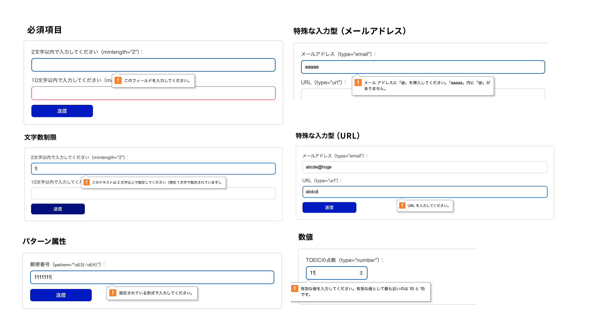
The demo links for each validation example are below.
Character length
Character length limits are mainly applied to text boxes and text areas. In HTML, the following attributes can limit the number of characters that can be entered.
minlengthattribute: minimum number of charactersmaxlengthattribute: maximum number of characters
<!-- Requires at least 2 characters -->
<input type="text" minlength="2">
<!-- Allows up to 10 characters -->
<input type="text" maxlength="10" />
When you use the maxlength attribute, users cannot enter more than the specified number of characters. If a string that exceeds the limit is pasted, the extra characters are cut off. The maxlength attribute is not always easy for users to work with, so consider carefully before using it.
Specialized input types
The input tag provides various type attributes for different purposes. Each type attribute has specific validation behavior. For example, the email type returns a validation error when the entered string does not match the format of an email address.
Common examples of type attributes used for text boxes are shown below.
<input type="email" />
<input type="url" />
Note: Types such as tel and password do not provide validation. They are intended to assist input. This is an easy point to misunderstand, so be careful.
The pattern attribute
Text input is highly flexible, so HTML provides a way to apply stricter validation. This is the pattern attribute. Validation with the pattern attribute uses regular expressions.
The following example assumes validation for a postal code. It checks whether the value is entered in the format of three digits, a hyphen, and four digits.
<input pattern="\d{3}-\d{4}" title="Please enter a value in the format 123-4567" />
The browser’s default message for a pattern mismatch can be abstract. By using the title attribute together with pattern, you can show a format hint even in the native validation UI. To always show the message as text, use setCustomValidity(), which is explained later.
Regular expressions can feel difficult to approach and are often avoided, but they are flexible, expressive, and well worth learning. The following article introduces regular expression techniques in detail. See it for more information.
Numbers
A numeric input form can be created by specifying type="number" on an input tag.
<input type="number" />
Numeric input forms provide the following types of validation.
max(maximum value),min(minimum value)step(increment interval for input values)
Date input
HTML also provides complex input controls such as date inputs. You can create a date input form by specifying type="date" on an input tag.
<input type="date" min="2025-01-01" max="2025-12-31" />
Date input forms provide the following types of validation.
max(latest date),min(earliest date)step(increment interval for input values; the unit differs depending on the type)
Date inputs, color pickers created with <input type="color" />, and similar controls are complex form controls, which makes them difficult to style freely with CSS.
These controls are useful for websites where native HTML forms are acceptable, or for demos before full-scale development. If you need a date input form with a custom design, you will need a custom implementation rather than a standard input tag.
Validation attributes common to form controls
So far, this article has introduced validation methods for individual form controls. Next, this section introduces validation attributes that can be used across form controls. Some have already appeared, but they are summarized again here.
The required attribute
For required fields, specify the required attribute. If a field with the required attribute is left empty when the user attempts to submit the form, a validation error occurs.
Attributes that define length and size
The following attributes have appeared several times already, but here is a summary.
min,max: specify the minimum and maximum numeric values.minlength,maxlength: specify the minimum and maximum string lengths.
If these conditions are not met, a validation error occurs.
Example form: job application form
Here is an example form that uses the validation techniques covered so far. This demo is a job application form.
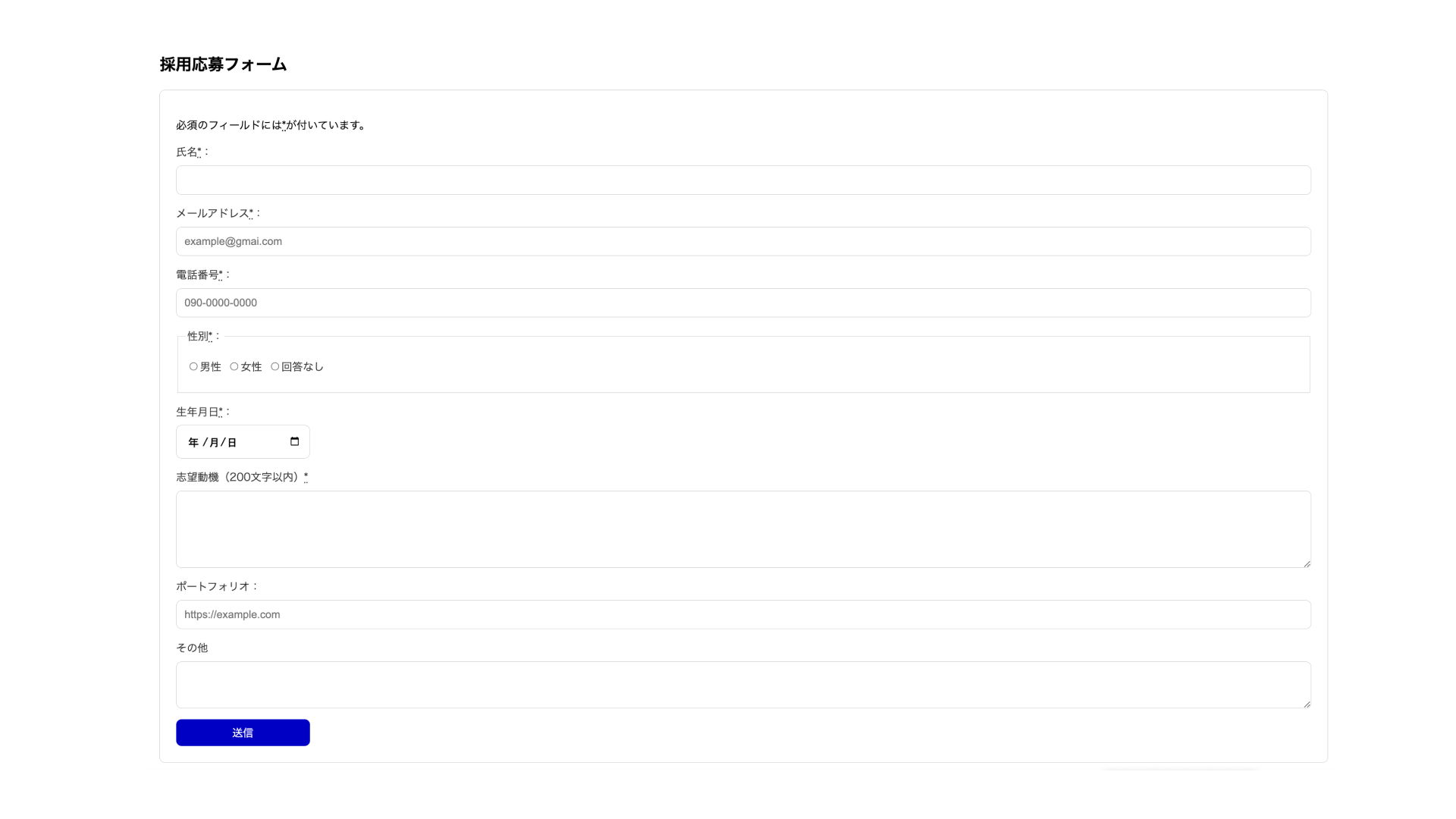
The requirements for each field are shown in the table below.
| Field | Validation |
|---|---|
| Name | Required, character length limit |
| Email address | Required, email address format |
| Phone number | Required, phone number format |
| Gender (male, female, no answer) | Required |
| Date of birth | Required, date format |
| Reason for applying | Required, character length limit |
| Portfolio URL | URL format |
| Other | None |
The form can be submitted only when all fields meet the requirements.
Form validation design
The example above implements only the minimum required HTML. In real websites, however, validation errors need to be fed back to users. For forms with better usability, you need to consider the following points.
- Error styles
- How to show error messages
- When to show validation errors
The following sections look at each point in more detail.
Error styles
CSS provides the :valid and :invalid pseudo-classes as a way to detect errors. These pseudo-classes, also introduced in 『CSS疑似クラスを活用した、モダンでインタラクティブなフォームの作り方』, are applied only to elements with validation errors.
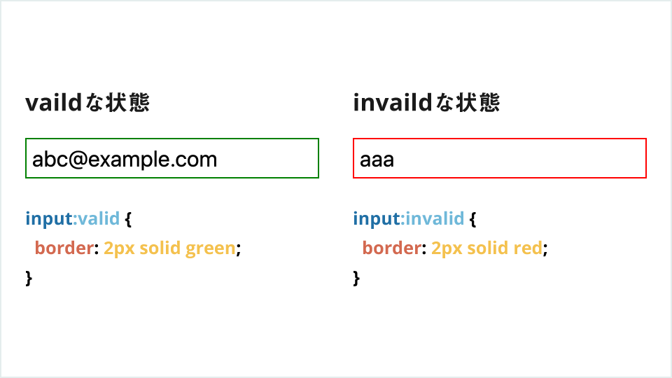
However, these pseudo-classes have a drawback. Take a form with the required attribute as an example. If the form is empty, the pseudo-class applies. Because the field is naturally empty when the page first opens, the error message is shown from the beginning. Users can be surprised when a field is already marked as an error before they have entered anything.
The pseudo-classes that address this issue are :user-valid and :user-invalid. These pseudo-classes are applied according to the validation result after user input. As of November 2023, major browsers support them and they are part of Baseline. An empty required field does not match :user-invalid until the user interacts with it or attempts to submit the form.
The following example gives feedback based on the validation result after user input.
<label>
  Name (required, at least 3 characters):
  <input type="text" required minlength="3" />
  <span></span>
</label>
input {
  & ~ span::after {
    display: inline-block;
    width: 8px;
    height: 8px;
  }

  &:user-valid ~ span::after {
    content: "✓ Entered";
    color: green;
  }

  &:user-invalid ~ span::after {
    content: "Validation error";
    color: red;
  }
}
These pseudo-classes are very useful for giving feedback in response to user interaction.
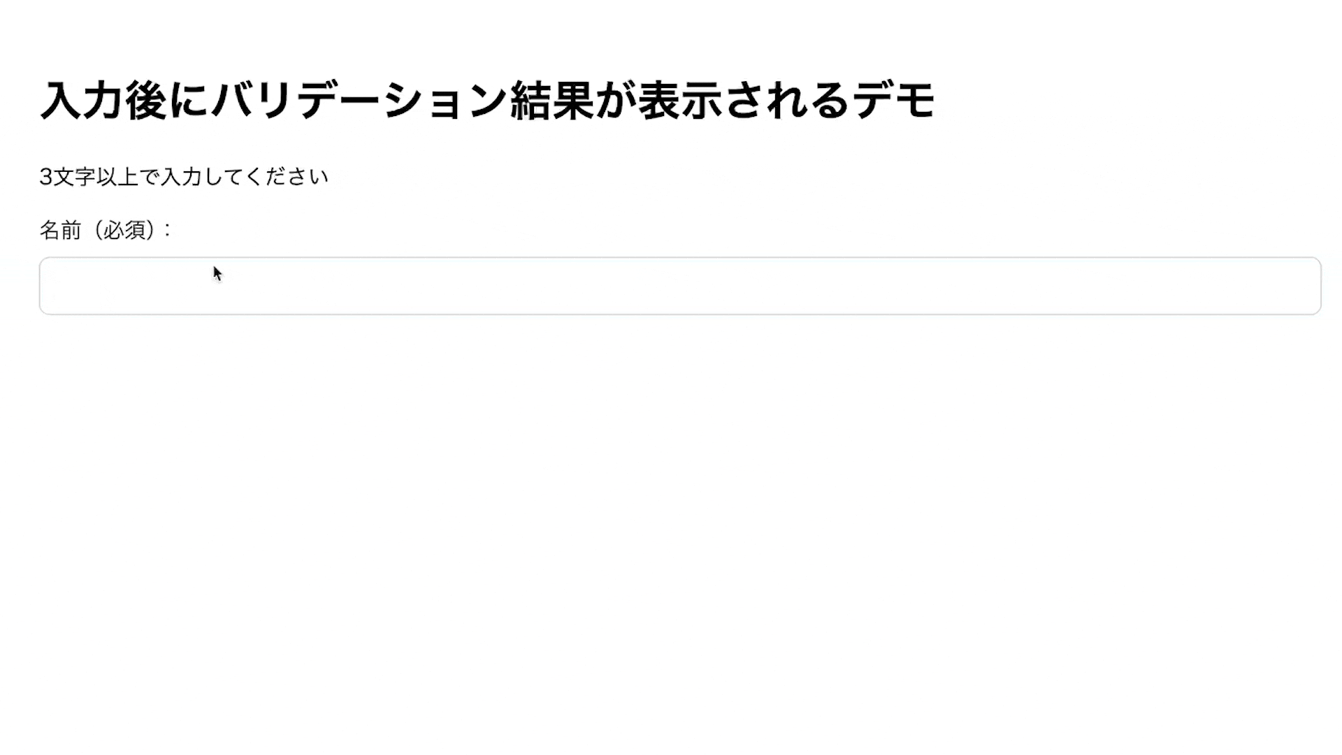
What to do before showing errors
It is important to let users know that a validation error has occurred. Even more important, however, is to tell users the input rules in advance. In the following form example, the user learns about the character length limit only after entering a value. This creates friction for users.
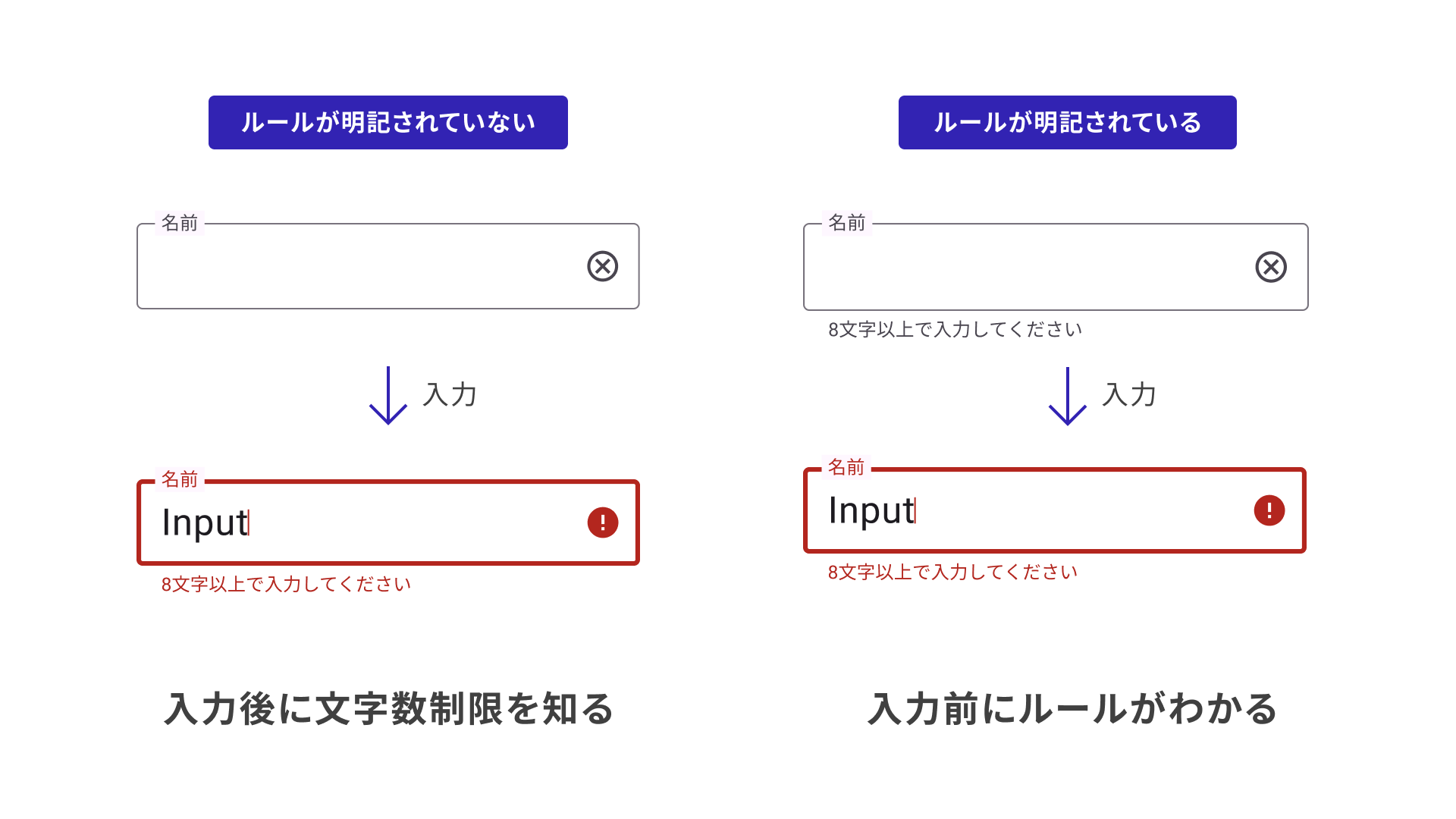
Build forms from the user’s perspective and aim for forms that are easy to use.
Accessibility considerations
Design validation so that it is also communicated correctly through assistive technologies. Add a <label> to each input field, and associate hints and error messages with the field by using aria-describedby. When an error occurs, add aria-invalid="true". If the message should be announced immediately, add role="alert" to the message element. Note that CSS :user-invalid does not automatically synchronize with assistive technology state.
Displaying validation error messages
So far, this article has explained validation using basic HTML features. Next, let’s look at more advanced validation expressions that also use JavaScript. First, consider how to display error messages.
Showing validation error messages as persistent text
With built-in HTML behavior, validation errors are displayed in a popup when the user submits the form. In real forms, validation messages are often displayed as text.
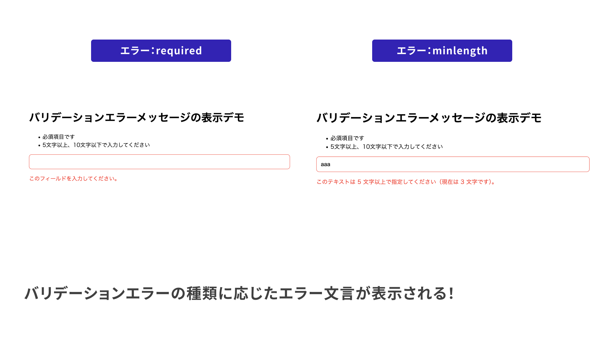
However, when multiple validation rules are configured, validation error messages differ by error. Consider the following example, which has multiple validation conditions.
<input required minlength="5" maxlength="10" />
This field has validation rules for “required,” “minimum length,” and “maximum length.” The following implementation displays the corresponding message as HTML text when any of these validation errors occur.
The next code example uses the Constraint Validation API to retrieve the validation error message returned by the browser and display it as HTML text.
<input required minlength="5" maxlength="10" aria-describedby="message" />
<p id="message" class="message" role="alert"></p>
const input = document.querySelector("input");
const message = document.querySelector(".message");

// Fires when focus leaves the form control
input.addEventListener("blur", (e) => {
  // Did the value pass validation?
  const isValid = input.checkValidity();
  if (isValid) {
    // Clear the error message
    message.textContent = "";
    input.setAttribute("aria-invalid", "false");
  } else {
    // Get the error message
    const errorMessage = input.validationMessage;
    message.textContent = errorMessage;
    input.setAttribute("aria-invalid", "true");
  }
});
aria-describedby associates the error message element with the input field, and aria-invalid is switched according to the validation result.
The actual behavior is shown below.
See the following for details.
- MDN - Using HTML form validation and the Constraint Validation API
- MDN - Client-side form validation
Displaying custom validation error messages
Add a “half-width alphanumeric characters only” validation rule to the previous example. Use the pattern attribute.
<!-- Enter half-width alphanumeric characters -->
<input required minlength="5" maxlength="10" pattern="^[0-9A-Za-z]+$" />
In this case, when the value does not match the regular expression, the error message is displayed as something like “Please match the requested format.” The exact message differs by environment.
Users cannot tell what to fix from that message, so it is better to show “Please use half-width alphanumeric characters.” In cases like this, you can rewrite the validation error message. You can check whether a pattern mismatch has occurred with input.validity.patternMismatch. The sample code is shown below.
const input = document.querySelector("input");
const message = document.querySelector(".message");

// Fires when focus leaves the form control
input.addEventListener("blur", (e) => {
  input.setCustomValidity("");
  // Did the value pass validation?
  const isValid = input.checkValidity();
  if (isValid) {
    // Clear the error message
    message.textContent = "";
  } else {
    // Rewrite the validation message when there is a pattern mismatch
    if (input.validity.patternMismatch) {
      input.setCustomValidity("Please use half-width alphanumeric characters.");
    }
    // Get the error message
    const errorMessage = input.validationMessage;
    message.textContent = errorMessage;
  }
});
This makes the defined error message appear when there is a pattern mismatch, while other errors display the message provided by the browser. After overriding a message with setCustomValidity(), reset it with setCustomValidity("") each time validation runs. A message set once does not disappear automatically.
There is also reportValidity(). During normal submission, the browser automatically validates the form and displays the standard balloon if there is an error. Call reportValidity() when you want to stop submission with JavaScript and still show the balloon, or when you have disabled automatic checks on submission with <form novalidate>.
Disabling the submit button
In real forms, designs often enable the button only when the form has passed validation.
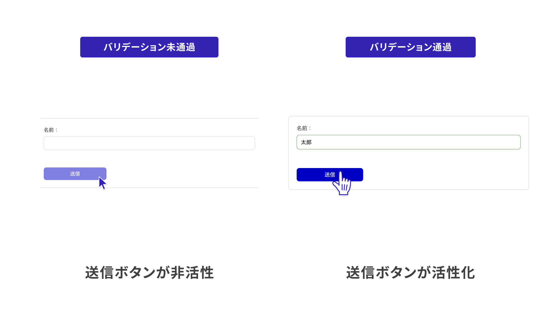
However, this implementation requires care. With built-in HTML behavior, validation errors are shown when the form is submitted. If the submit button can no longer be pressed, users may not be able to understand what the validation error is. When controlling whether the button is enabled or disabled, always display the validation error message.
When a button is disabled with the disabled attribute, it can no longer receive keyboard focus.
pointer-events: none blocks only pointer clicks, so the button may still be focusable and operable with the keyboard.
CSS-based approach
First, consider an approach that does not use JavaScript.
With the introduction of the CSS :has() relational selector, CSS can now check whether a form contains an element with the :invalid pseudo-class. The following example implements a submit button that becomes inactive when any element has a validation error, using only HTML and CSS.
As described earlier, an error message is displayed for the form with the validation error.
<form>
  <label>
    Name:
    <input type="text" required />
  </label>
  <span>Please enter your name</span>
  <button class="submit">Submit</button>
</form>
label ~ span {
  visibility: hidden;
}
label:has(input:user-invalid) ~ span {
  visibility: visible;
  color: red;
}
form:has(input:invalid) .submit {
  opacity: 0.5;
  pointer-events: none;
}
This is a clear example of an implementation that used to be difficult without JavaScript, but is now possible thanks to the evolution of HTML and CSS.
JavaScript-based approach
In the JavaScript example, validation is checked during input for all input elements. When there are no validation errors, the submit button is enabled.
const inputs = document.getElementsByTagName("input");
const button = document.querySelector("button");
// Function that checks whether all elements pass validation
const checkValidate = () => {
  const valid = [];
  for (const input of inputs) {
    valid.push(input.checkValidity());
  }
  return valid.every((v) => !!v);
};

let isValid = false;
// Check validation while input is being entered in all input elements
for (const input of inputs) {
  input.addEventListener("input", () => {
    isValid = checkValidate();
    // Switch the button's enabled state according to the validation state
    button.disabled = !isValid
  });
}
Both approaches have advantages and disadvantages, so choose the right one for the situation.
Improving the demo
Using the knowledge covered so far, the job application form demo has been improved. The following features have been added.
- Validation error messages
- Input styles based on validation state
- Button enabled/disabled state
See the following links.
Submitting forms
Finally, this section covers form submission. That said, HTML forms submit input values as they are, so no special handling is needed.
Two properties are required.
action: defines where submitted values are sent. For same-domain endpoints, relative paths such as/submitcan also be used.method: uses either"get"or"post"for HTTP communication. The difference is whether the submitted values are included in the URL.
Also, a <button> element inside a <form> tag is automatically assigned type="submit". The following is a minimal example that sends input values to a server.
<form action="http://localhost:3000/submit" method="post">
  <input type="text" />
  <button>Submit</button>
</form>
Sample code for a server implementation that returns the submitted values as-is is included in the repository. Clone the source code from the following link and try running the application.
Submitting forms with JavaScript
Depending on the application requirements, you may not submit form input values as-is. Instead, you may process them with JavaScript and submit them through a FormData object. Handling input values with JavaScript will be covered in the next article.
Conclusion
This article focused on HTML validation features and explained form validation. It is no exaggeration to say that the usability of a form depends on how validation is handled. By displaying appropriate validation messages at the right time, users can enter values without confusion.
High-quality validation implementation requires broad knowledge of HTML, CSS, and JavaScript. This article should serve as a starting point for learning those techniques.
The follow-up article, Type-safe form validation with React, React Hook Form, and Zod, introduces more advanced validation implementation techniques.
- Cross-field checks using JavaScript
- Robust validation using TypeScript and Zod
- Building forms with React and related libraries
- Form-related features added in React 19
Related articles also introduce best practices for input forms. See them as well.