Scroll-driven Animations use the amount scrolled to control an animation’s progress. They make it possible to create scrub animations that stay fully synchronized with scrolling, as well as sticky effects, using CSS alone.
This article divides CSS scroll animations into the following two types:
- Scroll-driven animations: Progress is linked to the amount scrolled.
- Scroll-triggered animations: A scroll position triggers a time-based animation.

The following demos use CSS alone. They do not use any JavaScript.
Benefits and considerations of scroll animations
Scroll animations offer benefits such as the following:
- Guiding attention through the content
- Creating a more immersive website experience
Effective animation can contribute to a better user experience. However, some users are uncomfortable with motion or prone to motion sickness.
Consider respecting reduced-motion preferences for users who find scroll animations uncomfortable. The article “CSSでもアクセシビリティに配慮しよう! モーション軽減・文字サイズ変更・ダークモードの実装方法” (Japanese) explains how to implement this.
Scroll-driven animations
Scroll-driven animations use one of the following timelines, depending on the scroll range linked to the animation:
- Scroll Progress Timeline: Represents the overall scroll progress of a scroll container. Specify it with the
scroll()function. - View Progress Timeline: Represents the progress of a target element as it passes through the scrollport. Specify it with the
view()function.
Scroll Progress Timeline
A Scroll Progress Timeline treats scrolling from the beginning to the end of a scroll container as progress from 0% to 100%.

The following example creates a scrub animation in which an element scales up vertically as the page scrolls.
Left: the demo described below; right: a variation
1. Preparation: Add the element to animate (div.animationElement), then give the body element enough height to make the page scroll.
<div class="animationElement"></div>
body {
  height: 200vh; /* Add enough height to make the page scroll */
}
2. Define the animation: Create the animation with an @keyframes rule and apply it to the element.
/* Keyframes that change the vertical scale */
@keyframes grow-progress {
  from {
    scale: 1 0;
  }
  to {
    scale: 1 1;
  }
}
3. Set the timeline: Specify the scroll() function for the animation-timeline property.
.animationElement {
  /* Styles */
  position: fixed;
  width: 100px;
  height: 100px;
  background: royalblue;
  transform-origin: bottom; /* Use the bottom edge as the transform origin */

  /* Scroll animation settings */
  animation: grow-progress linear; /* Apply the animation with linear easing */
  animation-timeline: scroll();
}
The scrub animation is now complete with just a few lines of CSS.
View Progress Timeline
A View Progress Timeline treats the range in which a target element passes through the scrollport as progress from 0% to 100%.

Next, the following example creates a scrub animation in which a mask changes as the animated element enters the viewport while the page scrolls.
1. Preparation: Add the element to animate (div.animationElement), with elements (div.skeleton) before and after it that provide enough height to make the page scroll.
<div class="skeleton">This area provides enough space to make the page scroll</div>
<img class="animationElement" src="./images/sapphire.webp" alt="Sapphire" width="300" height="300">
<div class="skeleton">This area provides enough space to make the page scroll</div>
.skeleton {
  height: 100vh; /* Add enough height to make the page scroll */
}
2. Define the animation: Create the animation with an @keyframes rule and apply it to the element.
This example uses a mask animation.
/* Change the mask from a circle through a rounded rectangle to a square */
@keyframes reveal-image {
  from {
    clip-path: inset(30% round 20%);
  }
  to {
    clip-path: inset(0);
  }
}
3. Set the timeline: Specify the view() function for the animation-timeline property.
4. Set the animation range: Configure the animation-range property.
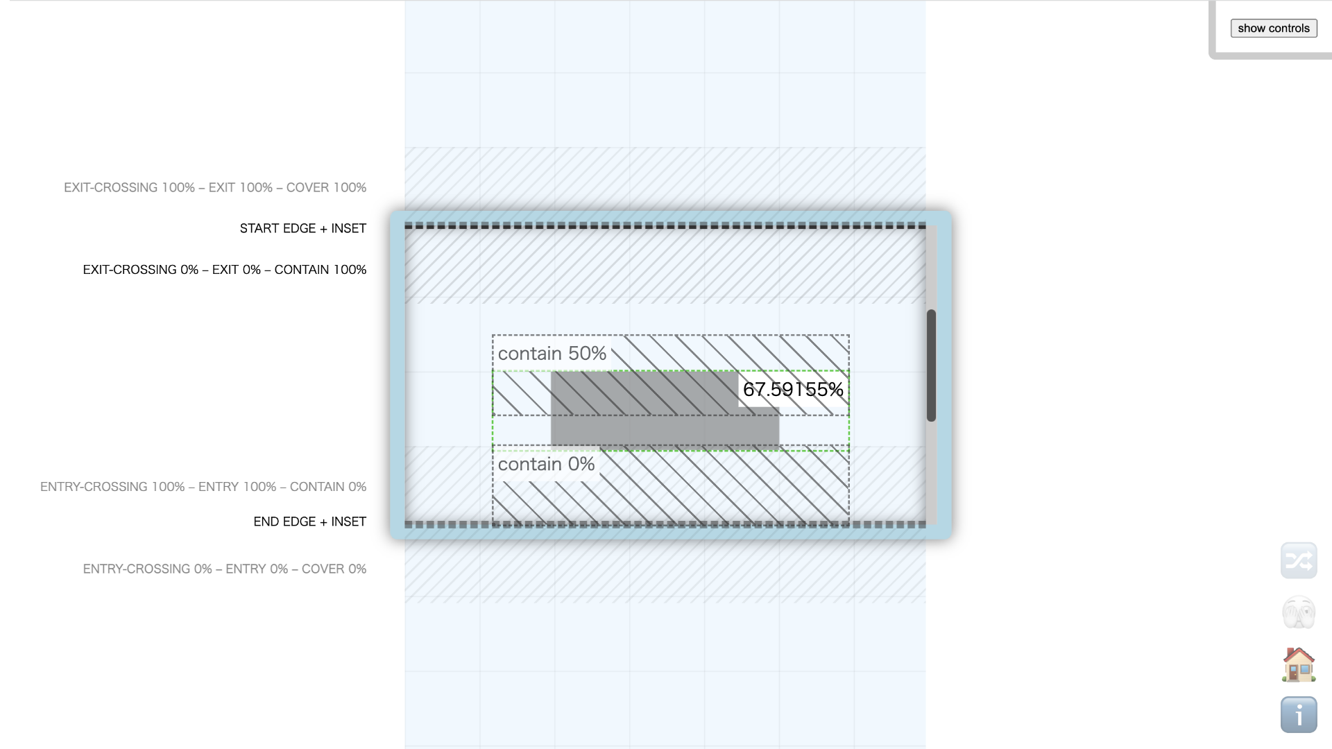
The animation starts when the image is fully inside the viewport (contain 0%) and ends when the image reaches the middle of the viewport (contain 50%).
.animationElement {
  /* Scroll animation settings */
  animation: reveal-image linear both; /* Linear easing with animation-fill-mode: both */
  animation-timeline: view();
  animation-range: contain 0% contain 50%; /* Start: fully inside the viewport; end: at the middle of the viewport */
}
The animation-range property accepts many possible values, which can make the options difficult to understand. The View Progress Timeline: Ranges and Animation Progress Visualizer can help. It lets you adjust the values and see the ranges in a clear visualization.
Example with animation-range: contain 0% contain 50%;
Example: Combining with sticky positioning
This example uses the two timelines introduced above and combines sticky effects with parallax. It incorporates part of a story, with decorative elements and animations designed to create a sense of immersion.
Scroll-driven animation demo page

Every animation in the example uses either a Scroll Progress Timeline (scroll()) or a View Progress Timeline (view()) to control its progress. See the source code for details.
Scroll-triggered animations
Scroll-triggered animations use a scroll position as the playback trigger, while the animation itself progresses over time like a conventional animation.
Timeline trigger basics
In the following demo, the text “Animation Item” appears from the right over one second when it is fully inside the viewport. Because the animation progress is not linked to scrolling, it continues to the end even if scrolling stops.
/* Keyframes that fade in from the right */
@keyframes motion {
  from {
    opacity: 0;
    translate: 100px 0;
  }
}

.target {
  opacity: 1;
  translate: 0 0;

  /* Use view() to determine the element's position. Activate at contain and deactivate outside cover. */
  timeline-trigger: --target view() contain / cover;
  /* Give each matching element its own trigger */
  trigger-scope: --target;
  /* A standard time-based animation */
  animation: motion 1s both;
  /* Play forward while active and backward when inactive */
  animation-trigger: --target play-forwards play-backwards;
}
The view() function determines the element’s position as it passes through the viewport. The contain and cover keywords define the detection ranges. With this configuration, the animation plays forward with play-forwards when the entire element enters the viewport, and plays backward with play-backwards when the element moves completely outside the viewport.
Example: Revealing a heading one character at a time
Scroll-triggered animations are also useful for revealing a heading one character at a time. The following example implements an effect often seen on brand websites, where the letters of a heading emerge from a mask one by one, using CSS alone without JavaScript. Revealing the letters in sequence gives the effect a refined feel.
The same effect can also be implemented with GSAP. The article “Getting started with GSAP, part 3: ScrollTrigger, MotionPath, FLIP, and text animation” shows how. One advantage of the GSAP implementation is that it works in all major browsers.
Browser support
The animation-timeline property used for scroll-driven animations is supported in Chrome and Edge 115 or later (released in July 2023) and Safari 26.0 or later (released in September 2025).
Reference: Can I use…
The animation-trigger property used for scroll-triggered animations is available in Chrome and Edge 146 or later (released in March 2026). As of August 2026, Safari 26.6 and Firefox 154 do not support it.
Reference: Can I use…
Conclusion
This article introduced scroll-driven and scroll-triggered animations that can be created with CSS alone. You may now find it easier to implement the animations you have in mind. As implementation becomes easier, deciding what kind of animation to create may become increasingly important.