HTML and CSS keep evolving. Features that once required JavaScript can now often be implemented with HTML and CSS alone. With HTML’s new command and commandfor attributes, along with interestfor, dialogs and popovers can be controlled with HTML alone. This article also introduces a different approach to UI development: declaring commands in HTML and using them to control the interface.
Controlling dialogs and popovers without JavaScript using command / commandfor and interestfor
First, here are examples of dialogs and popovers that can now be implemented without JavaScript by using the command, commandfor, and interestfor attributes. These new attributes are especially useful when building dialogs and popovers.
The command attribute
The command attribute runs in response to a user action such as a click.
The command and commandfor attributes are used on <button> elements. Together, they let you declare a dialog’s open and closed state using only HTML. Set command to the command you want to run, such as show-modal, and set commandfor to the target element’s id value. Both are required.
<button command="show-modal" commandfor="my-dialog">Open the modal dialog</button>

<dialog id="my-dialog">
  <p>This is where the modal dialog description goes.</p>
  <button command="close" commandfor="my-dialog">Close</button>
</dialog>
In the same way, you can also open and close a popover with the command and commandfor attributes. These are also set on a <button> element.
<button command="show-popover" commandfor="popoverElement">Open a popover with `command`</button>

<div id="popoverElement" popover>
  <p>Popover content</p>
</div>
Previously, controlling a <dialog> element required JavaScript. Popovers could already be implemented with HTML alone by using the popovertarget attribute, but command and commandfor make dialogs and popovers feel more consistent to write. This article only introduces simple dialogs and popovers, but the articles below cover more practical usage and customization, so take a look at those as well.
The command attribute includes the following built-in commands for declaratively controlling dialog and popover state from HTML.
show-modal: Open a modal dialogclose: Close a modal dialogrequest-close: Request that a modal dialog close (equivalent to pressing the Escape key)show-popover: Open a popoverhide-popover: Close a popovertoggle-popover: Toggle a popover
request-close is similar to close, but the behavior is slightly different. For details, see コラム:close()とrequestClose()メソッドの違い. There is also a custom-command mechanism that lets you issue your own commands, which is covered later in this article.
Note that these attributes do not work when a <button> behaves like type="submit", such as when it is used inside a <form>. In that case, set the button’s type to button.
The interestfor attribute
The interestfor attribute runs when the user hovers for a certain amount of time or focuses an element. Previously, there was no event that directly represented a user showing interest. Separate from hover and focus as raw interactions, HTML can now declaratively trigger behavior based on user interest. Because this is built into HTML itself, it can benefit a wider range of browsing environments and users.
As with commandfor, set interestfor to the id value of the element you want to display.
<button interestfor="popoverElement">Open the popover after a short hover or on focus</button>
<div id="popoverElement" popover>
  <p>Popover content</p>
</div>
This should be useful for implementing tooltips.
Using command and interestfor with JavaScript
So far, the examples have shown that these attributes can be used with HTML alone and without JavaScript. They are also useful from JavaScript.
Using the command attribute with JavaScript
The element specified by commandfor can detect the command triggered by the command attribute with addEventListener. The command itself can also be defined as a custom command. Custom commands use names prefixed with --, much like CSS custom properties. This prefix is required.
<button command="--custom-command" commandfor="commandTarget">Run a custom command</button>

<div id="commandTarget">
  <p>This element receives the custom command.</p>
</div>
const commandTarget = document.getElementById("commandTarget");
commandTarget.addEventListener("command", (event) => {
  // The custom command value is available as event.command.
  console.log(event.command); // Output: --custom-command
});
One advantage of the command event is that you do not need to attach a click handler to the button itself. Traditionally, the button also needed a click event handler. With the command event, the button can simply declare the command, and the receiving side handles it.
You can also branch behavior by sending different custom commands. The following example changes the color when a button is pressed.
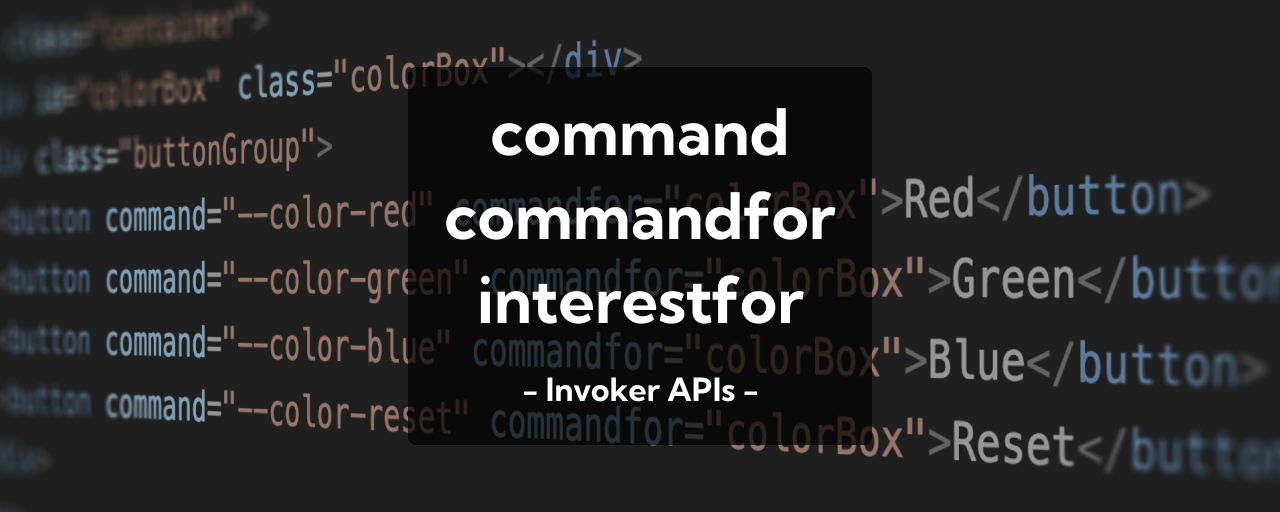
<div id="colorBox" class="colorBox"></div>

<button command="--color-red" commandfor="colorBox">Red</button>
<button command="--color-green" commandfor="colorBox">Green</button>
<button command="--color-blue" commandfor="colorBox">Blue</button>
<button command="--color-reset" commandfor="colorBox">Reset</button>
const colorBox = document.getElementById("colorBox");

colorBox.addEventListener("command", (event) => {
  const command = event.command;
  switch (command) {
    case "--color-red":
      colorBox.style.backgroundColor = "red";
      break;
    case "--color-green":
      colorBox.style.backgroundColor = "green";
      break;
    case "--color-blue":
      colorBox.style.backgroundColor = "blue";
      break;
    case "--color-reset":
      colorBox.style.backgroundColor = "transparent";
      break;
  }
});
The command attribute can also be useful in React. Traditionally, exchanging actions between distant components in React required global state, the Context API, or prop drilling. With the command attribute, even components that are far apart can communicate more easily.
The following example adds an item to the cart icon in the top-right corner when the Add to cart button is clicked.
Product.tsx (excerpt)
import { CART_ID } from "./Cart";

const Product: React.FC<ProductType> = ({ productId, productName, price }) => {
  return (
    <div className="productCard">
      {/* Product image, etc. */}
      <button
        className="basicButton addToCartButton"
        command="--add-to-cart"
        commandfor={CART_ID}
        data-product-id={productId}
        data-product-name={productName}
      >
        Add to cart
      </button>
    </div>
  )
}
Cart.tsx (excerpt)
export const CART_ID = "cart";
const Cart = () => {

  /* Cart state and add-to-cart logic, etc. */

  /**
   * Handler for the command event
   */
  const handleCommand = useCallback(
    (event: CommandEvent) => {
      // The event type is extended in a custom types.d.ts file.
      const source = event.source;
      const productId = source.dataset.productId;
      const productName = source.dataset.productName;

      if (!productId || !productName) {
        return;
      }
      handleAddToCart(productId, productName);
    },
    [handleAddToCart],
  );

  useEffect(() => {
    const cartElement = cartRef.current;
    if (!cartElement) {
      return;
    }

    cartElement.addEventListener("command", handleCommand);

    return () => {
      cartElement.removeEventListener("command", handleCommand);
    };
  }, []);

  return (
    <div>
      {/* Render the cart contents */}
    </div>
  )
}
The cart in the header and the product component often end up far apart in the tree. With command and commandfor, a deeply nested button component can declaratively say that an item should be added to the cart. On the cart side, event.source gives you the source element, so product data can be read from data-* attributes.
One thing to watch out for is that the value of commandfor must match the target element’s id attribute. This can become difficult when IDs are assigned dynamically, so it helps to use a shared constant, as in the code above, to keep both values in sync.
Also, when using TypeScript, CommandEvent and InterestEvent may not yet be included in your type definitions because these APIs are so new. In that case, you need to add declarations with declare.
This lets distant components exchange information without prop drilling or global state. It is a somewhat unconventional React approach, but it also shows how the command attribute can support a new pattern.
Using the interestfor attribute with JavaScript
The element specified by interestfor can also be detected with addEventListener. The following example shows a preview when the user shows interest in a link. JavaScript is used to fetch the destination page’s Open Graph data.
<a href="page1.html" interestfor="preview">Page 1</a>
<a href="page2.html" interestfor="preview">Page 2</a>
<a href="page3.html" interestfor="preview">Page 3</a>

<div class="preview" id="preview" popover="auto">
  <img src="" alt="Open Graph image" class="ogpImage" width="240" height="180" />
  <div class="ogpContent">
    <h2 class="ogpTitle"></h2>
    <p class="ogpDescription"></p>
  </div>
</div>
Excerpt of the main logic
const previewElement = document.querySelector(".preview");
previewElement?.addEventListener("interest", async (event) => {

  const sourceElement = event.source;
  const url = sourceElement.href;

  const response = await fetch(url);
  const html = await response.text();

  // Parse the HTML with DOMParser
  const parser = new DOMParser();
  const doc = parser.parseFromString(html, "text/html");

  // Get the title (og:title)
  const title =
    doc.querySelector(`meta[property="og:title"]`)?.getAttribute("content") ??
    "";

  // Get the description (og:description)
  const description =
    doc
      .querySelector(`meta[property="og:description"]`)
      ?.getAttribute("content") ?? "";

  // Get the image (og:image)
  const image =
    doc.querySelector(`meta[property="og:image"]`)?.getAttribute("content") ??
    "";

  previewImageElement.src = image;
  previewTitleElement.textContent = title;
  previewDescriptionElement.textContent = description;
});
Unlike a hover event, this does not run the instant the pointer enters the element. It runs only after the hover continues for a short time and the user has shown interest. The same is true for focus.
Browser support
The command and commandfor attributes are available in Chrome and Edge 135 (April 2025), Safari 26.2 (December 2025), and Firefox 144 (October 2025) and later.
Reference: Can I use…
The interestfor attribute is available in Chrome and Edge 142 (October 2025) and later.
Reference: Can I use…
Conclusion
This article introduced HTML’s command / commandfor attributes and the interestfor attribute. They can eliminate the need for JavaScript in some cases, simplify JavaScript when it is still needed, and open up a different way to build UI.
command / commandfor and interestfor are part of the Invoker Commands API and the Interest Invokers API. As the name Invoker suggests, they point toward a more declarative way to build UI in HTML.