
The sibling-index() and sibling-count() CSS functions return an element’s position among its siblings and the total number of sibling elements as integers. Because they return numeric values, they can be combined with functions such as calc().
A clear example is a staggered animation, where elements animate one after another with a slight delay. Until now, creating a staggered animation in CSS usually meant writing separate selectors such as :nth-child(1), :nth-child(2), and so on, or assigning indexes in JavaScript. With sibling-index() and sibling-count(), you can build the same kind of flexible styling in pure CSS, without that extra work.
This article introduces several ideas for using these two CSS functions, including staggered animations.
What are sibling-index() and sibling-count()?
First, here is a quick look at how these two CSS functions work.
sibling-index()
sibling-index() returns an integer representing the element’s position among its siblings.
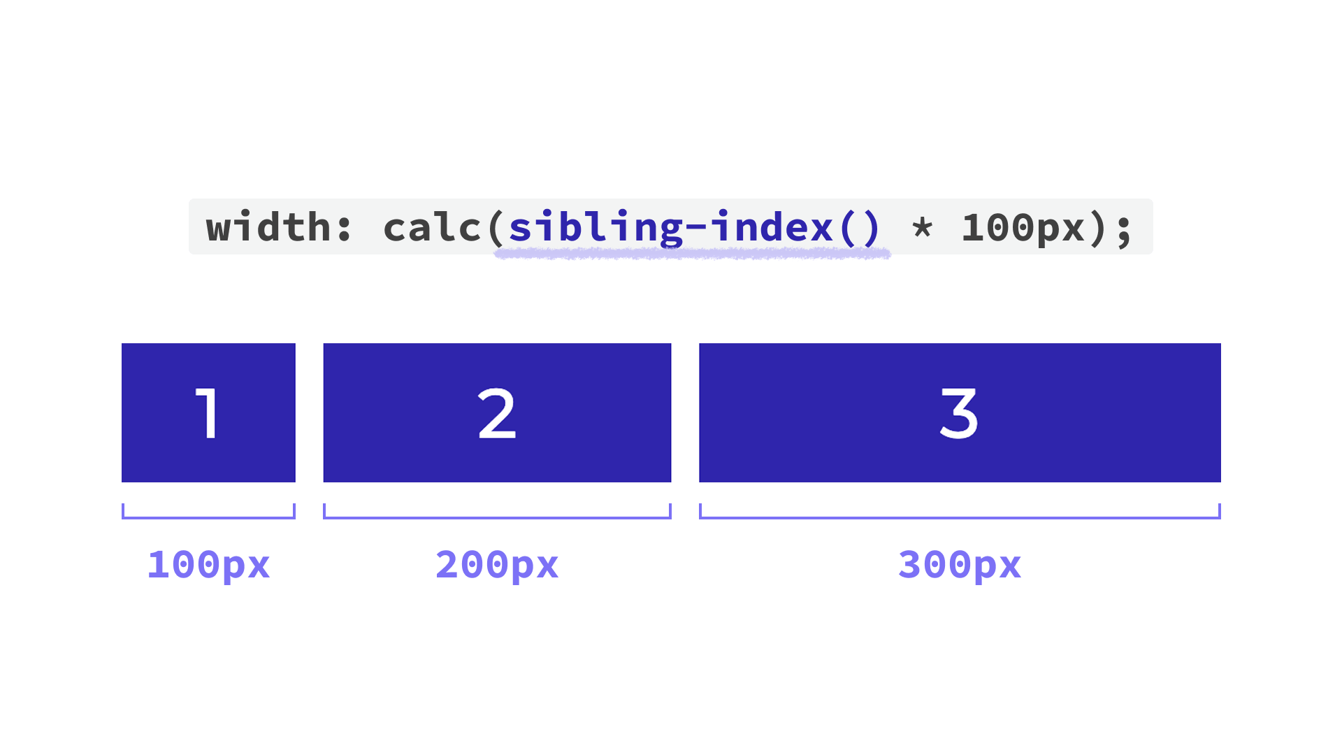
In the following example, sibling-index() is used inside calc() so that each item’s width changes depending on its position. This function is used without any arguments.
<ul>
  <li>1</li>
  <li>2</li>
  <li>3</li>
</ul>
li {
  /* Apply this to the list items */
  width: calc(sibling-index() * 100px);
}
Decorative styles have been omitted from the code above.
Like the :nth-child() pseudo-class, counting starts at 1. That means the first item’s width is 1 × 100px, or 100px. The second becomes 200px, the third becomes 300px, and so on.
sibling-count()
As the name suggests, sibling-count() returns an integer representing the total number of sibling elements.
sibling-count() includes the element itself in the total (siblings + itself).
In the following example, each item’s width changes based on the total number of items in its list.
<!-- First list -->
<ul>
  <li>1</li>
  <li>2</li>
</ul>

<!-- Second list -->
<ul>
  <li>1</li>
  <li>2</li>
  <li>3</li>
</ul>
li {
  /* Apply this to the list items */
  width: calc(sibling-count() * 100px);
}
As shown below, each item in the first list becomes 200px wide, while each item in the second list becomes 300px wide. Like sibling-index(), sibling-count() is also used without arguments.

You can also inspect the actual value returned by sibling-index() or sibling-count() in the browser’s developer tools.
The screenshot below shows Chrome DevTools with the first list item selected, using sibling-index() as an example.
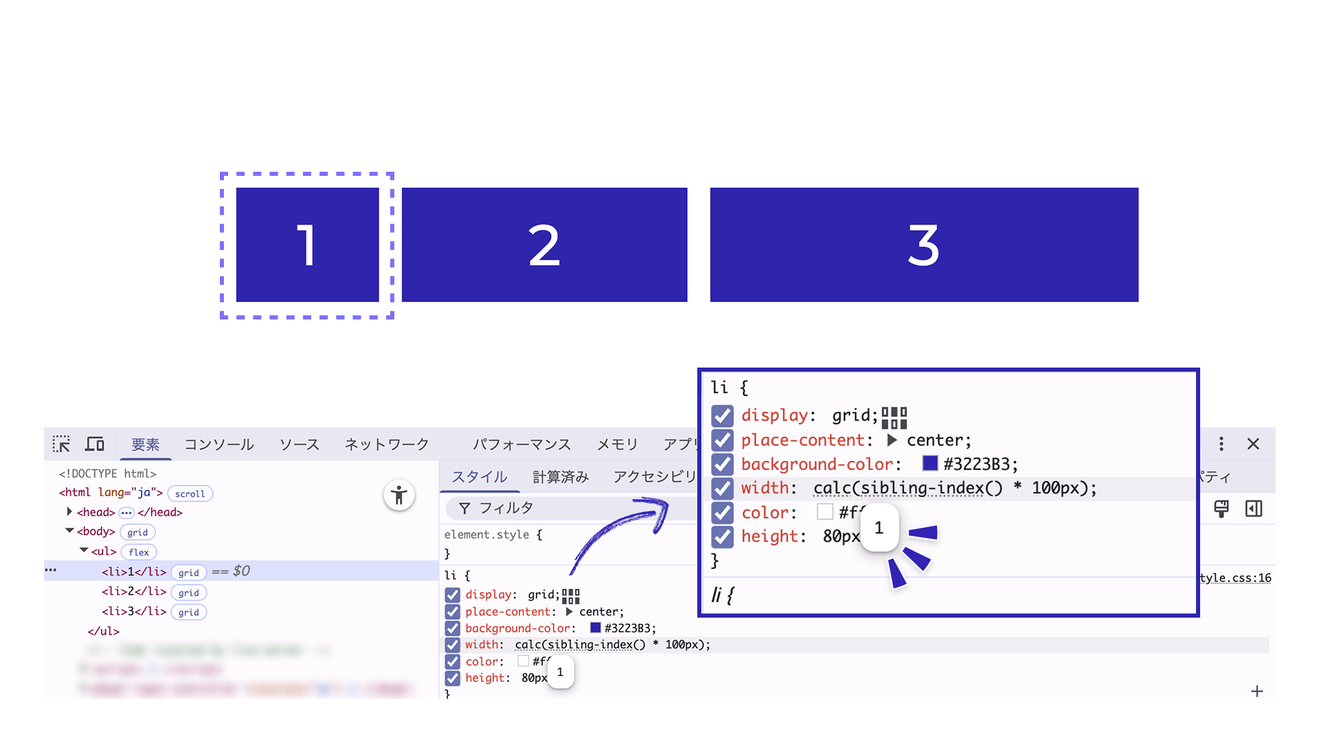
In the Styles panel, the sibling-index() value in the CSS is shown with a faint dotted underline. When you hover over it, DevTools displays the actual resolved value, such as 1 or 2 (1 in the screenshot above). You can inspect sibling-count() in the same way.
1. Create a staggered animation with sibling-index()
The following demo shows items appearing one after another. Each one rotates slightly as it appears. This kind of motion, where elements animate in sequence with a time offset, is called a staggered animation.
Click the button below to play the animation.
Using sibling-index() makes the CSS much simpler. As mentioned earlier, you no longer need to enumerate :nth-child() selectors or add indexes in the HTML.
HTML excerpt:
<ul>
  <li></li>
  <li></li>
  <li></li>

  <!-- Additional li elements follow -->
</ul>
CSS excerpt:
/* Styles for the aligned state */
li {
  transform: rotate(0deg);
  transition: opacity 0.4s, transform 0.4s;
  transition-delay: calc((sibling-index() - 1) * 0.05s);
}

/* Styles for the initial render */
@starting-style {
  li {
    --rotate-deg: calc((sibling-index() - 1) * 1.5deg);
    opacity: 0;
    transform: rotate(var(--rotate-deg));
  }
}
Decorative styles have been omitted from the code above.
In this demo, sibling-index() is used in the transition-delay property so that the delay increases according to each item’s position. That creates the staggered appearance, with each item appearing slightly later than the previous one. Here, the first item should appear with no delay, so 1 is subtracted from sibling-index() in advance to make it effectively zero-based.
The @starting-style at-rule lets you define the styles used when an element first appears. Here, the initial state sets opacity: 0 to hide the items and applies a slight rotation using an angle calculated from sibling-index() (--rotate-deg). Once displayed, the items appear to rotate into place one by one.
The nice part is that this works in pure CSS, regardless of how many elements there are, and without adding any extra attributes to the HTML.
2. Change colors item by item with sibling-index()
sibling-index() also works well with CSS color functions such as hsl() and oklch(), where colors are expressed as combinations of numeric values.
Combining it with hsl()
hsl() is a function that lets you specify hue, saturation, and lightness numerically.
In the demo above, sibling-index() is included inside hsl(), so the saturation changes according to the position of each list item.
The first item has a saturation of 100%, and each following item decreases by 15%.
CSS excerpt:
li {
  /* Change saturation by 15% for each item */
  background: hsl(200deg calc(100% - (sibling-index() - 1) * 15%) 60%);
}
Combining it with oklch()
You can also change the hue step by step to create a look similar to a color wheel.
Like hsl(), oklch() specifies colors numerically, but it is designed so that numeric changes more closely match perceived visual changes. That makes it less likely to produce uneven brightness, even when you apply fixed increments such as the values returned by sibling-index().
CSS excerpt:
/* Change the hue by 15 for each item */
li {
  background: oklch(80% 0.25 calc((sibling-index() - 1) * 15));
}
In this demo, sibling-index() is also used in the rotate() value of the transform property so the items can be arranged in a circle.
CSS excerpt:
li {
  transform: translate(-50%, -50%) rotate(calc((sibling-index() - 1) * 15deg)) translateY(-260px);
}
Because this demo uses 24 items, the angle is fixed at 15deg (360 / 24). To calculate the angle automatically based on the number of elements, combine it with sibling-count() and write something like 360deg / sibling-count(). The next section looks at that approach in more detail.
3. Combine both functions to build a hand-of-cards UI
Here is a UI example that combines sibling-index() and sibling-count().
The cards are arranged in a fan, like a hand of playing cards. Hover over a card and click the “✕” button to remove it. Even after cards are removed, the remaining cards automatically reposition themselves so the layout stays balanced.
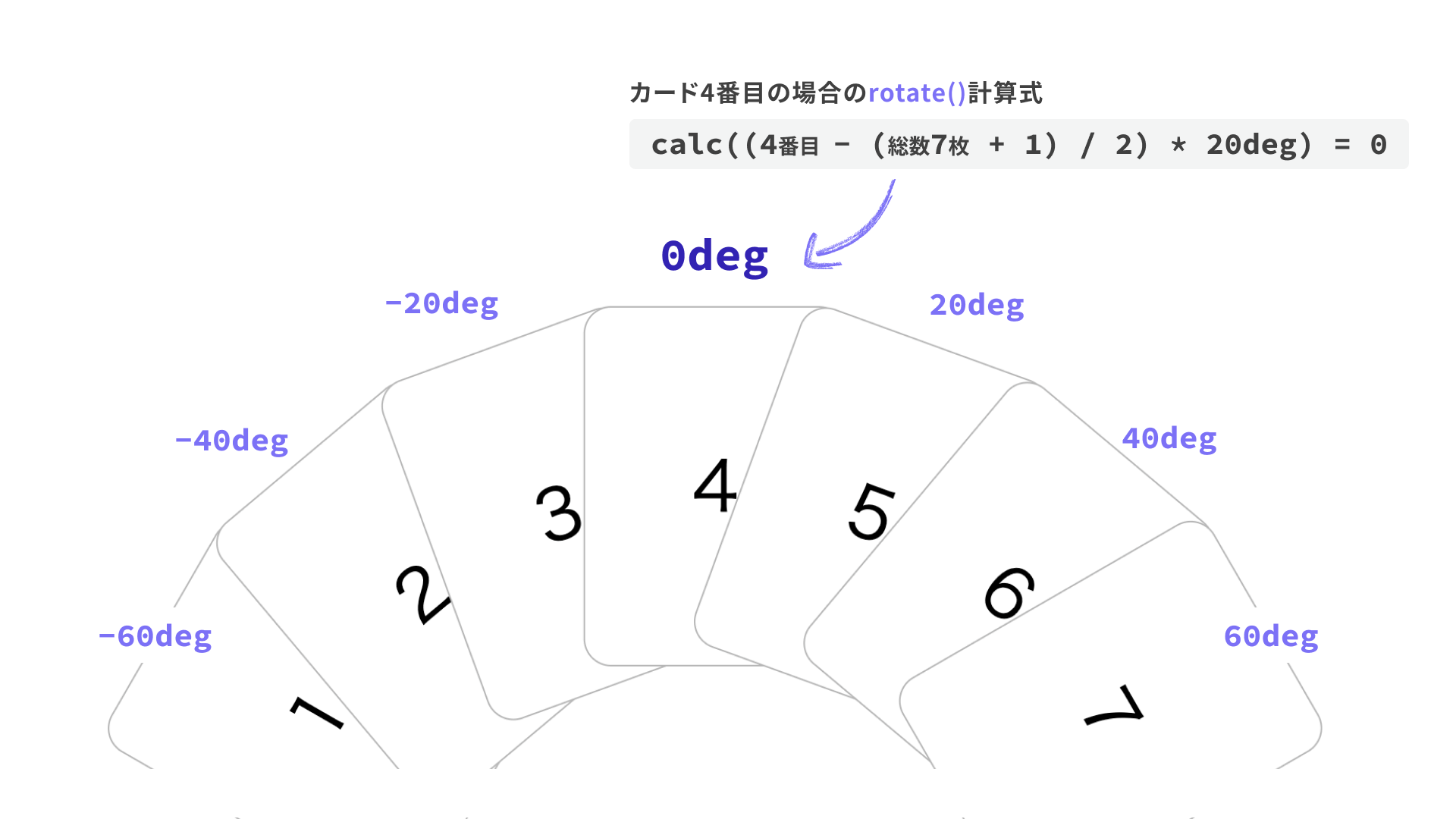
The key part is the rotate() value inside the transform property applied to each list item. Both sibling-index() and sibling-count() are used to calculate how much each card should tilt.
CSS excerpt:
li {
  /* Only the transform value is shown here */
  transform:
    translateX(-50%)
    rotate(
      calc(
        (sibling-index() - (sibling-count() + 1) / 2) * 20deg
      )
    )
    translateY(-160px);
}
The expression inside calc() treats the center of the full set of cards as 0, then increases the rotation angle as cards move farther outward.
The (sibling-count() + 1) / 2 part is what calculates the center position of the full hand. In this example, there are 7 cards total, so the expression becomes (7 + 1) / 2, which evaluates to 4.
Substituting that into the full calc() expression gives (4 - 4) * 20deg = 0, so the fourth card is displayed with no tilt. The cards to the left and right of it then increase by 20deg step by step.
If you reduce the total to 6 cards, the third and fourth cards are repositioned so they still appear centered, so try removing cards in the demo and see how the layout adjusts.
Combining sibling-index() and sibling-count() like this opens up more layout possibilities in pure CSS.
Browser support
Both sibling-index() and sibling-count() are available in Chrome and Edge 138 (June 2025) and Safari 26.2 (December 2025) or later.
Reference: Can I use…
Conclusion
This article introduced sibling-index() and sibling-count() through several implementation examples. They are especially useful for flexible, CSS-only handling of UIs with a variable number of elements, whether you are building staggered animations, gradual color changes, or dynamic layout adjustments. They are well worth trying in your own projects.
