
Website animations often include microinteractions that respond to user input. Adding microinteractions helps communicate state changes through smooth motion, which can improve both usability and the overall user experience.
This article walks through how to build microinteractions with Motion (formerly Framer Motion) and React. It uses eight commonly used UI components as examples, including buttons, modals, accordions, and segmented buttons. Each example also includes a brief code walkthrough, so you can understand what Motion is doing and reuse the patterns as-is.
What is Motion?
Motion is an animation library. It used to be a React-only library called Framer Motion, but since November 2024 it has been available as “Motion” not only for React, but also for Vue and vanilla JavaScript.
Partly because of that history, it works especially well with React, and one of its biggest advantages is that animations can be written declaratively.
Installing Motion in React
This article assumes a React project using a JavaScript bundler such as Vite. For more about Vite and bundlers, see the article jQueryからTypeScript・Reactまで! Viteで始めるモダンで高速な開発環境構築.
Install Motion from npm:
npm install motion
The motion package includes the React module, so import it like this:
import { motion } from "motion/react";
Motion can also be used with Vue and vanilla JavaScript, not just React. See the official site for setup instructions for each environment.
Basic Motion usage in React
Here is a quick look at how to use Motion in React. Use Motion components such as <motion.div> and <motion.button> for the elements you want to animate, then describe the animation in props.
import { motion } from "motion/react";

// Move the element 100px to the right when it mounts
<motion.div animate={{ x: 100 }} />;
Motion also provides props for more detailed animation control, along with event-related props. See the official Motion documentation for details.
1. A button that shrinks slightly when clicked
When a button is clicked or tapped, giving users clear feedback that it was pressed helps them feel more confident about the interaction. Here is an example of a button that becomes slightly smaller while it is being pressed.
Excerpt of the main part only:
<motion.button
  className="basicButton activeFbButton"
  // whileTap: animation applied while the button is pressed
  // scale: shrink to 0.95
  whileTap={{ scale: 0.95 }}
  transition={{
    // animation duration: 0.1 seconds
    duration: 0.1,
  }}
>
  Click me
</motion.button>
2. A ripple button
This is a ripple button where a wave spreads outward from the point that was clicked. The ripple element is moved to the click position, then animated with scale and opacity so it expands outward. The animation is reset by changing the key. Changing the key makes React treat it as a different element, so the animation starts fresh every time.
Excerpt of the main part only:
<button
  className="basicButton rippleButton"
  ref={buttonElementRef}
  onClick={handleClick}
>
  Click me
  {rippleAnimationKey > 0 && (
    <motion.span
      style={{ left: clickX, top: clickY }}
      className="rippleWrapperElement"
    >
      <motion.span
        key={rippleAnimationKey}
        className="rippleEffectElement"
        initial={{ opacity: 1, scale: 0 }} // initial state: opacity 1, scale 0 (a point)
        animate={{ opacity: 0, scale: 1 }} // end state: opacity 0, scale 1 (expanded)
        transition={{
          duration: 0.5, // animation duration: 0.5 seconds
          ease: "easeOut", // easing function (decelerating motion)
        }}
      ></motion.span>
    </motion.span>
  )}
</button>
3. Modal dialog enter and exit animations
This example animates a modal dialog as it opens and closes. The dialog uses the HTML <dialog> element. Because it has both enter and exit animations, it defines them with Motion’s variants feature. variants lets you treat animation properties like named states, which makes animation definitions easier to understand.
The dialog is opened and closed using the standard <dialog> methods showModal() and close(). When you add animation to a native feature like this, one of the key points is managing both the dialog’s open/close state and the animation state correctly.
In other words, when opening the dialog, you can change the element state at the start of the animation. When closing it, however, the element state needs to change only after the animation finishes.
Excerpt of the open/close logic:
// Function that opens the modal
const handleOpen = () => {
  modalDialogRef.current?.showModal();
  setIsOpen(true);
};

// Function that closes the modal
const handleClose = (
  event: SyntheticEvent<HTMLDialogElement> | MouseEvent<HTMLButtonElement>,
) => {
  event.preventDefault();
  setIsOpen(false);
};

// Function called when the modal animation finishes
const handleAnimationComplete = (definition: AnimationDefinition) => {
  // When the exit animation ("hidden") finishes, actually close the dialog
  if (definition === "hidden") {
    modalDialogRef.current?.close();
  }
};
When opening the dialog, showModal() and setIsOpen(true) are called first. When closing it, the animation state isOpen is changed first so the exit animation can run, and once that animation is complete, handleAnimationComplete() calls close() to close the dialog. That is the key implementation detail in this dialog animation.
For more about modals, see the article モーダルUIをシンプルにできる! 進化を続けるHTMLのdialog要素. As support for the CSS @starting-style rule and the allow-discrete value becomes more common across browsers, open and close animations like this will likely become possible with CSS alone.
4. Accordion open and close animations
This example animates an accordion opening and closing. It combines a height animation with an opacity animation for the content.
It uses the <details> and <summary> elements. Like modal dialogs, <details> has built-in open/close behavior, so you need to manage the animation state and HTML state carefully.
Excerpt of the state management logic:
// State for managing whether the accordion is open
const [isOpen, setIsOpen] = useState(false);

// Function that toggles the accordion when clicked
const handleClick = (event: MouseEvent<HTMLElement>) => {
  event.preventDefault();

  const detailsElement = detailsRef.current;
  if (!detailsElement) {
    return;
  }
  // Open it if the accordion is currently closed
  if (!detailsElement.open) {
    detailsElement.open = true;
    setIsOpen(true);
  } else {
    // Close it if the accordion is currently open
    setIsOpen(false);
  }
};

// Function called when the accordion is toggled
// This is used when the accordion opens or closes passively,
// for example through in-page search.
const handleToggle = () => {
  const detailsElement = detailsRef.current;
  if (detailsElement && detailsElement.open) {
    setIsOpen(true);
  }
};

// Function called when the accordion animation finishes
const handleAnimationComplete = (definition: AnimationDefinition) => {
  // When the closing animation ("closed") finishes, actually close the details element
  if (definition === "closed") {
    if (detailsRef.current) {
      detailsRef.current.open = false;
    }
  }
};
<details onToggle={handleToggle}>
  {/* omitted */}
</details>
One difference from the modal example is that an accordion can be opened and closed not only by an explicit user click, but also passively through in-page search. For that reason, an onToggle event listener is added to the <details> element so that handleToggle() runs when it opens through in-page search.
For more about accordion UIs, see the article Building an animated accordion with HTML details and summary. It is worth a read. Accordion UIs are sometimes implemented like {isShow && <div>...</div>}, where the <div> is not mounted while the accordion is closed. However, using the built-in open/close behavior of the HTML <details> element has advantages, such as allowing words inside the accordion to be found by the browser’s search feature.
The UI also switches between “+” and “-” icons as the accordion opens and closes. The <AnimatePresence> component is useful for this kind of DOM switching. If you set an exit prop on a component inside <AnimatePresence>, you can define the animation that runs when that DOM node is removed.
Excerpt of the icon-switching part:
<AnimatePresence initial={false}>
  {isOpen ? (
    <motion.span
      className="accordionIcon"
      variants={iconVariants}
      initial="closed"
      animate="open"
      exit="closed"
      transition={{ duration: 0.3 }}
      key="closed"
    >
      -
    </motion.span>
  ) : (
    <motion.span
      className="accordionIcon"
      variants={iconVariants}
      initial="closed"
      animate="open"
      exit="closed"
      transition={{ duration: 0.3 }}
      key="open"
    >
      +
    </motion.span>
  )}
</AnimatePresence>
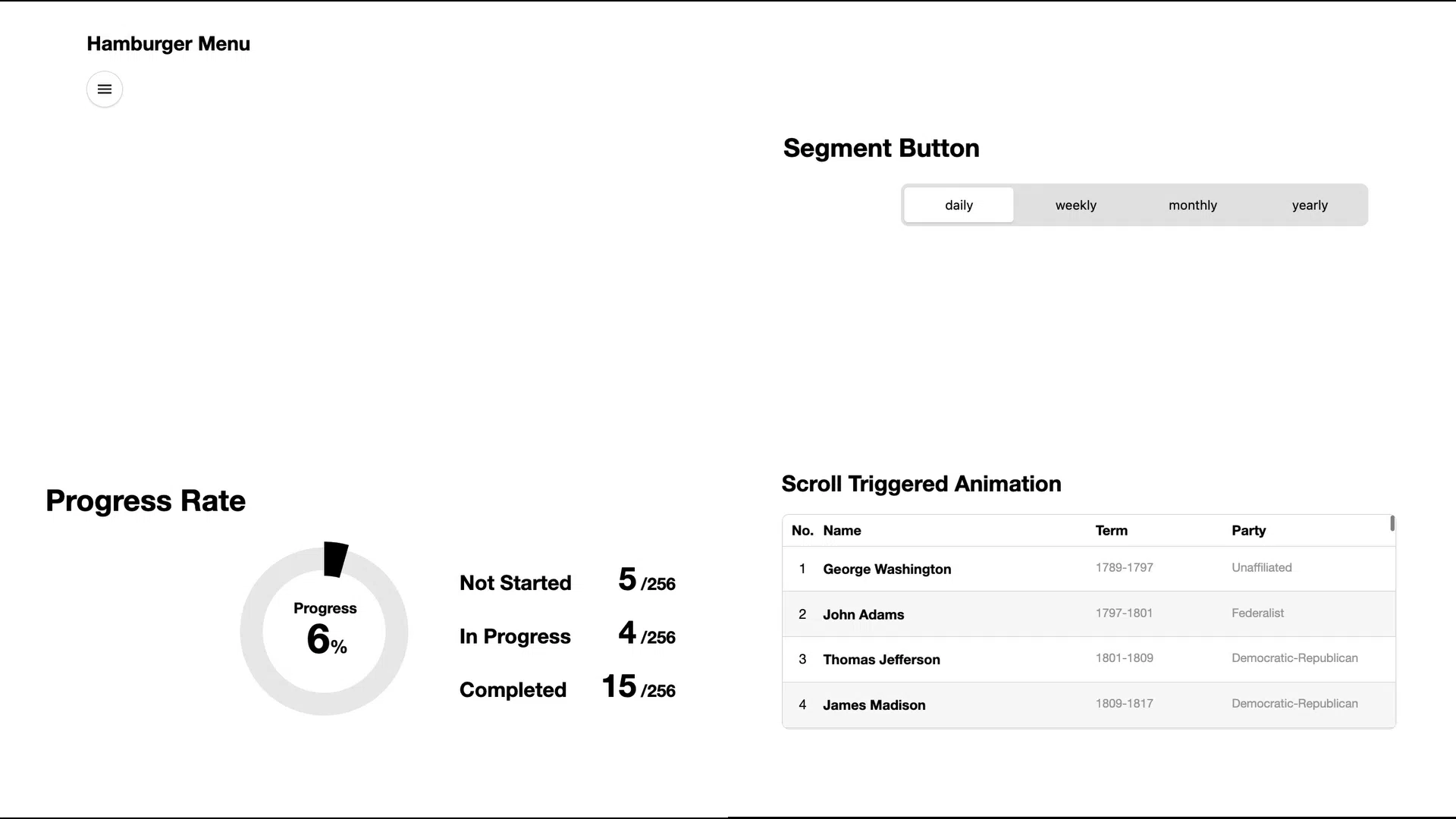
5. Segmented button
This is an animation for a segmented button that switches between multiple states. The background follows the selected option, making the state change clear at a glance. The animation is built by combining an array of segments with variants.
It combines a useState() value with variants to drive the animation.
Excerpt of the state and variants setup:
const SEGMENT_BUTTON_LIST = ["daily", "weekly", "monthly", "yearly"] as const;

const [activeSegment, setActiveSegment] =
  useState<(typeof SEGMENT_BUTTON_LIST)[number]>("daily");

// Animation definitions for the background
const variants: Variants = {
  daily: {
    x: 0, // position of the first button (x = 0)
  },
  weekly: {
    x: 120, // position of the second button (x = 120px)
  },
  monthly: {
    x: 240, // position of the third button (x = 240px)
  },
  yearly: {
    x: 360, // position of the fourth button (x = 360px)
  },
};
In the sample, the positions are fixed in pixels for clarity. In a production UI, computing x dynamically from the button width makes the implementation more resilient to layout changes.
<motion.div
  className="segmentButtonBackground"
  variants={variants}
  animate={activeSegment}
  transition={{ duration: 0.3, ease: EASE_OUT_QUART }}
></motion.div>
{
  SEGMENT_BUTTON_LIST.map((segment) => (
    <button
      className="segmentButton"
      onClick={() => handleSegmentClick(segment)}
      key={segment}
    >
      {segment}
    </button>
  ));
}
6. Scroll-triggered animation
This is an animation that appears when an element enters the browser viewport during scrolling. To run the animation, use the whileInView prop. The same approach also works well for softly revealing text as the user scrolls.
Excerpt of the main part only:
<ul className="listItems">
  {presidentList.map((item, index) => (
    <motion.li
      key={index}
      className="listItem"
      variants={variants}
      initial="invisible"
      whileInView="visible"
      viewport={{ amount: 0.4, once: true }} // run once when 40% of the element enters the viewport
      transition={{
        opacity: { duration: 0.3 },
        y: { duration: 0.4 },
      }}
    >
      <span className="listItemIndex">{index + 1}</span>
      <span className="listItemName">{item.name}</span>
      <span className="listItemTerm">{item.term}</span>
      <span className="listItemParty">{item.party}</span>
    </motion.li>
  ))}
</ul>
7. Hamburger menu
This is an animated hamburger menu. In addition to the menu open/close animation, it also adds a snappy entrance for the menu items. For staggered, sequential motion, it uses the stagger feature.
Excerpt of the animation definition that uses stagger:
// Animation definitions for items inside the hamburger menu
const variants = {
  open: {
    transition: {
      // stagger: animate child elements one after another
      // start each one 0.08s apart, with the first starting after 0.2s
      delayChildren: stagger(0.08, { startDelay: 0.2 }),
      ease: EASE_OUT_QUART,
      duration: 0.5,
    },
  },
};
<motion.div
  className="menuList"
  variants={variants}
  initial="closed"
  animate="open"
  exit="closed"
  role="menu"
>
  {MENU_ITEMS.map((item) => (
    <motion.button
      key={item.name}
      className="menuItem"
      role="menuitem"
      onClick={handleClose}
      variants={buttonVariants}
      transition={{ ease: EASE_OUT_QUART, duration: 0.5 }}
    >
      {item.name}
    </motion.button>
  ))}
</motion.div>
8. Animating SVGs and values
So far the examples have focused mainly on moving elements around, but Motion can also animate JavaScript values and SVG paths. This example implements both an animated pie chart and animated numbers.
To animate JavaScript values, use useMotionValue() and useTransform(). Both are Motion APIs. useMotionValue() creates animatable values, and useTransform() converts them into values for display.
Excerpt of the value animation setup:
// Create animatable values with useMotionValue
const progressRate = useMotionValue(0);
const notStartedValue = useMotionValue(0);

// Compute display values (round decimals to integers)
const rate = useTransform(() => Math.round(progressRate.get()));
const notStartedCount = useTransform(() => Math.round(notStartedValue.get()));

// Animation settings for the SVG path (the circular stroke)
const drawPathVariants: Variants = {
  hidden: { pathLength: 0 }, // initial state: path length is 0 (the line is not visible)
  visible: {
    pathLength: PROGRESS_RATE, // end state: draw the path up to the progress ratio
    transition: { duration: 1.8, ease: EASE_OUT_QUART }, // animate over 1.8 seconds
  },
};

useEffect(() => {
  // Animate each value to its target
  // animate: animate a motion value to the specified value
  const progressRateAnimation = animate(progressRate, PROGRESS_RATE * 100, {
    duration: 1.8, // animation duration (seconds)
    ease: EASE_OUT_EXPO, // easing function (decelerating motion)
  });
  const notStartedValueAnimation = animate(notStartedValue, NOT_STARTED_VALUE, {
    duration: 1.8,
    ease: EASE_OUT_EXPO,
  });

  return () => {
    progressRateAnimation.stop();
    notStartedValueAnimation.stop();
  };
}, [animationKey]);
Conclusion
Motion works particularly well with React because it lets you add animation declaratively. The UI animations introduced here are not strictly necessary for functionality, but they can make interfaces feel richer and improve the user experience. All of the examples in this article are built with Motion’s basic features. With the right ideas and a bit of refinement, there is a lot more room to explore.
ICS MEDIA has many other articles on interaction and animation as well. The following articles are also worth reading: