The HTML dialog element makes it easy to implement modal dialogs. It has been available in major browsers since around 2022.
A modal is a UI pattern that prevents other interactions while it is displayed. Before the dialog element, implementing a modal meant handling all of the following manually:
- Displaying the modal UI in the frontmost layer of the screen
- Restricting other interactions while the modal UI is open
- Managing focus when the modal UI opens and closes
This complexity is also covered in the article “HTMLでモーダルUIを作るときに気をつけたいこと.” Many front-end engineers have had to deal with these issues firsthand.
Using the standard HTML dialog element provides a simpler and more consistent way to handle modal dialogs. This article introduces the basics of working with dialog.
This article covers:
- The basic usage of the
dialogelement - Useful attributes such as
closedbyandautofocus - Examples of styling
dialogwith CSS - How to use
dialogwithout JavaScript
How to use the dialog element
The following demo shows a modal dialog built with the dialog element. Clicking the button opens and closes the modal dialog.
<button id="showDialog">Open the modal dialog</button>

<dialog>
  <p>This is some explanatory text for the dialog box.</p>
  <button id="closeDialog">Close</button>
</dialog>
const dialog = document.querySelector("dialog");

const showButton = document.querySelector("#showDialog");
showButton.addEventListener("click", () => {
  dialog.showModal(); // Open the modal dialog
});

const closeButton = document.querySelector("#closeDialog");
closeButton.addEventListener("click", () => {
  dialog.close(); // Close the modal dialog
});
When the button is pressed, the dialog element appears on top of it. While the dialog is open, the button that opens it cannot be clicked.
The dialog element provides the following features out of the box:
- Displaying the dialog box in the frontmost layer of the screen
- Built-in methods for opening and closing it, such as
showModal()andclose() - Restricting other interactions while it is open, then restoring them when it closes
With the dialog element, you can create a modal dialog with minimal HTML and JavaScript. Now that the basic behavior is clear, let’s look at how to open and close it.
Opening a dialog
By default, the dialog element is hidden. There are three ways to show it:
- Call the
showModal()method in JavaScript - Call the
show()method in JavaScript - Add the
openattribute in HTML so thedialogelement is shown as soon as the page loads
Of these three, only the showModal() method displays the dialog element as a modal dialog. If you open it with show() or with the open attribute, it is displayed as non-modal. A non-modal UI appears on top of the page but does not restrict other interactions.
The example in the previous section opens the dialog element by calling showModal().
const dialog = document.querySelector("dialog");

const showButton = document.querySelector("#showDialog");
showButton.addEventListener("click", () => {
  dialog.showModal(); // Open the dialog element
});
Closing a dialog
There are several ways to close a displayed dialog element:
- Call the
close()method in JavaScript - Call the
requestClose()method in JavaScript - Use a browser- or OS-provided close action such as the ESC key
To close a dialog element directly, call the close() method. In the following example, clicking the close button runs close().
<dialog>
  <button>Close</button>
</dialog>
const dialog = document.querySelector("dialog");

/* Code for showing the dialog is omitted */

const button = document.querySelector("button");
button.addEventListener("click", () => {
  dialog.close(); // Close the dialog element
});
The close() method can also take a string argument, which can later be read through the returnValue property. A practical example appears later in this article.
Available events
The main events for the dialog element are:
close: Fired when thedialogelement closescancel: Fired when a close request occurs, such as pressing ESC, using the browser back action, or callingrequestClose(). Callingevent.preventDefault()prevents the dialog from closing.
These two events are similar, but their timing is different. For example, if a dialog element is closed with the close() method, only the close event fires. By contrast, if the user performs a close action such as pressing the ESC key, the cancel event fires first. If that event is not canceled, the close event fires afterward.
You can also read the argument passed to close() through event.target.returnValue in the close event. This is useful when you want to change the next step depending on which button was pressed. In the following example, the dialog element includes Cancel and Agree buttons, and additional logic runs only when the Agree button is pressed.
<dialog>
  <button id="disagree">Cancel</button>
  <button id="agree">Agree</button>
</dialog>
const dialog = document.querySelector("dialog");

// Add a close event listener
dialog.addEventListener("close", (event) => {
  if (event.target.returnValue === "agree") {
    // Run this when the Agree button is pressed
  }
});

// When the Cancel button is pressed
const disagreeButton = document.querySelector("#disagree");
disagreeButton.addEventListener("click", () => {
  dialog.close("disagree"); // Pass "disagree" to the close event
});

// When the Agree button is pressed
const agreeButton = document.querySelector("#agree");
agreeButton.addEventListener("click", () => {
  dialog.close("agree"); // Pass "agree" to the close event
});
Note: If you do not pass an argument to close(), or if the close event occurs because the user pressed ESC, the returnValue property returns an empty string ("").
Column: the difference between close() and requestClose()
The requestClose() method closes a dialog element by first firing a cancel event, which can be prevented by an event listener. That makes it fundamentally different from close().
For example, suppose a modal contains an input form. Before closing it, you might call a REST API and close the modal only if the request succeeds. If the request fails, the modal can stay open and preserve the form state.
Like close(), requestClose() can also set returnValue through its argument.
The requestClose() method is available in Chrome 134 and Edge 134 (March 2025), Safari 18.4 (March 2025), and Firefox 139 (May 2025) and later.
- Reference: dialog.requestClose() | Can I use…
Column: how interaction locking works
A modal dialog displayed with showModal() appears in a special layer called the top layer. When a dialog element is shown in the top layer, other elements cannot be clicked or focused, allowing the user to stay focused on the dialog box. In Chrome, you can confirm whether an element is in the top layer from the #top-layer entry in the Elements panel of DevTools.
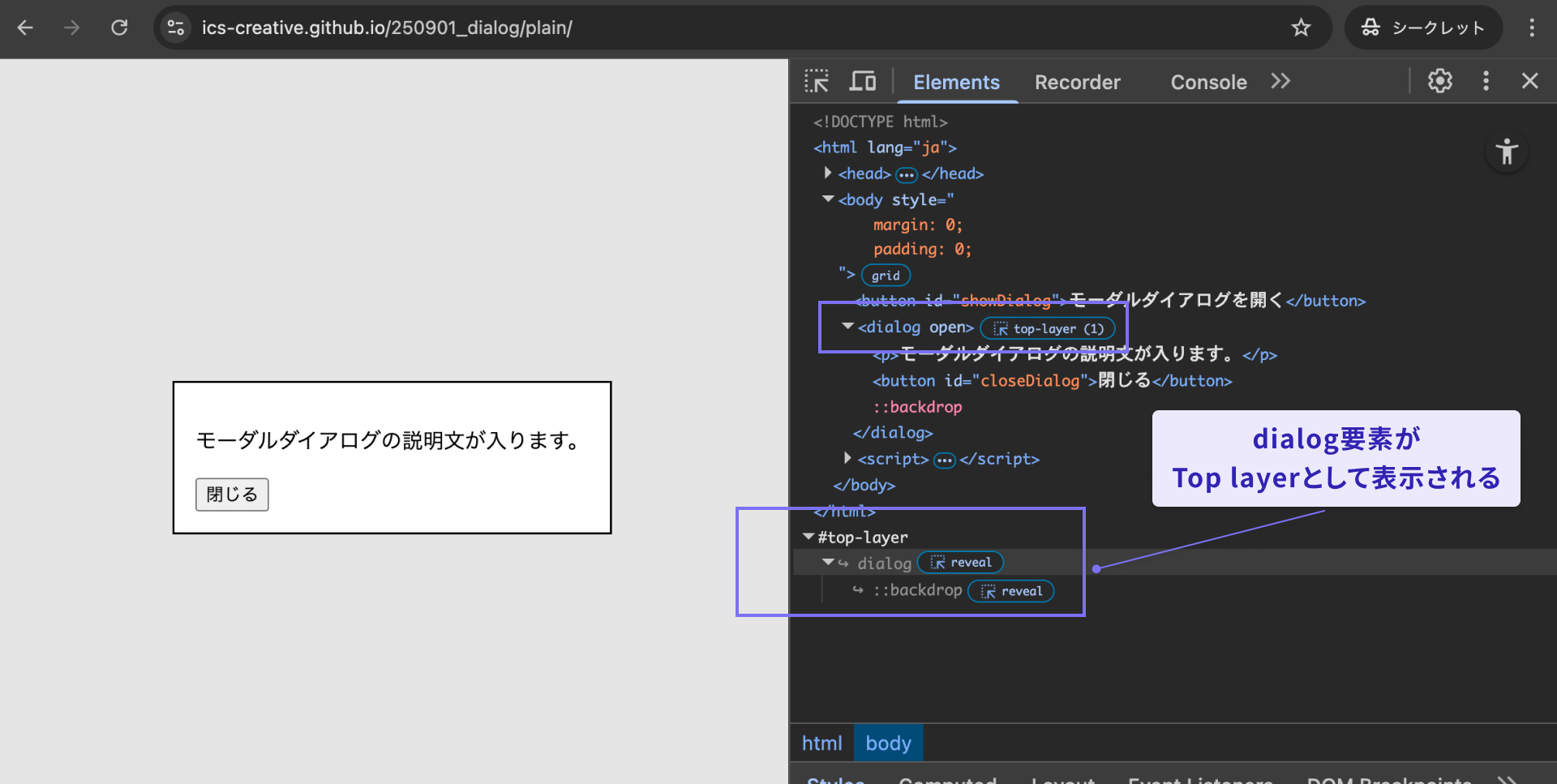
For more details about the top layer, see the MDN page below.
The command and commandfor attributes
So far, the examples have used JavaScript. However, the command and commandfor attributes let you open and close a dialog element without any JavaScript.
The setup is simple:
- Add an
idattribute to thedialogelement. - Set the
commandforattribute to theidof thedialogelement you want to control. - Set the command with the
commandattribute, such asshow-modalorclose.
<button command="show-modal" commandfor="my-dialog">Open the modal dialog</button>

<dialog id="my-dialog">
  <p>This is some explanatory text for the modal dialog.</p>
  <button command="close" commandfor="my-dialog">Close</button>
</dialog>
The command attribute accepts the following values. Each one corresponds to an existing JavaScript command:
show-modal: Opens the dialog as a modal (the same role as JavaScript’sshowModal())close: Closes the dialog (the same role as JavaScript’sclose())request-close: Requests that the dialog close (the same role as JavaScript’srequestClose())
Browser support
The command attribute is available in Chrome 135 and Edge 135 (April 2025), Safari 26.2 (December 2025), and Firefox 144 (October 2025) and later.
Reference: Invoker commands | Can I use…
The closedby attribute
One useful HTML attribute on the dialog element is closedby, which lets you fine-tune how easy the modal is to dismiss. Specifically, it controls whether the modal should close when the user clicks outside the dialog box or presses the ESC key. The possible closedby values are as follows:
any: The dialog can be closed by browser or OS close actions, or by clicking outside the dialog box (called light dismiss)closerequest: The dialog can be closed by browser or OS close actionsnone: The dialog ignores standard close actions and can be closed only with theclose()method (it does not close with the ESC key)
If closedby is omitted, the dialog can still be closed by browser or OS close actions. The following demo lets you test each closedby setting. You can change the value from the dropdown menu and try it yourself.
Browser support
The closedby attribute is available in Chrome 134 and Edge 134 (March 2025), and Firefox 141 (July 2025).
Reference: HTML element: dialog: closedby | Can I use…
The autofocus attribute
When a dialog element is shown, focus moves to the first focusable child element. If you want to change the initial focus target, use the autofocus attribute.
The following demo is a modal dialog that asks the user to agree to some terms. It contains two buttons, Cancel and Agree, and the Agree button has the autofocus attribute.
<dialog>
  <p>Do you agree to the terms?</p>
  <button>Cancel</button>
  <button autofocus>Agree</button>
</dialog>
By default, focus would move to the Cancel button, but in this demo you can confirm that it moves to the Agree button instead.
Browser support
The autofocus attribute is available in Chrome 79 and Edge 79 (January 2020), Firefox 110 (February 2023), macOS Safari 15.4 (March 2022), and iOS Safari 16.4 (March 2023).
Reference: HTML attribute: autofocus | Can I use…
Note: If an <input autofocus /> inside a non-modal dialog opened with the open attribute receives focus, iOS Safari 18.6 does not display the virtual keyboard as of September 2025.
Styling the dialog element
When implementing a modal dialog, you will often want to apply custom styles that match the design of the page. The following demo styles the dialog element as a delete confirmation dialog.
When applying custom styles, keep the following points in mind:
- Style the semi-transparent overlay outside the dialog box with the
::backdroppseudo-element - Target the open state with the
dialog[open]selector - When adding opening and closing animations, remember that a hidden
dialogelement usesdisplay: none, so define the initial animation styles with@starting-style
With some additional CSS features, you can also build demos like the following. This example uses anchor positioning and the linear() function.
Column: preventing the background from scrolling
In many modal implementations, you also need to prevent the page behind the modal from scrolling while the modal is open. One possible improvement is to suppress scrolling on the root element with the overflow property whenever a dialog element is open.
:root:has(dialog[open]) {
  overflow: hidden;
  scrollbar-gutter: stable;
}
Note: As of September 2025, even this approach is difficult to control completely in iOS Safari 18.6.
Conclusion
Building a modal UI manually with arbitrary elements such as <div> often requires complex control logic. Many websites still publish modal-like interfaces without fully implementing the behavior a real modal should provide.
With the dialog element, those difficult parts are already handled for you. If you need a modal dialog, it is worth starting with dialog first.
There are also related features worth watching, and broader support may follow over time.
- CloseWatcher API: Controls browser and OS close behavior. It can be used to decide whether a
dialogelement should really close when the ESC key is pressed.- Reference: CloseWatcher - Web APIs | MDN