
Checkboxes are one of those HTML and CSS components that become surprisingly tricky once you start customizing them. In most cases, you will use <input type="checkbox" />, but there are a few common challenges:
- The default
inputappearance varies by browser, and the CSS properties you can use are not consistent. - There are several implementation patterns, which makes it hard to decide which approach is best.
- Checkboxes have multiple states, and it is not always obvious which visual styles you need to prepare.
If you are not used to implementing them, it can be hard to know which approach to take. This article explains how to implement a custom checkbox in four practical steps.
What this article covers
- How to implement a custom checkbox with a simple HTML structure
- How to apply custom styling without losing the advantages of the standard
inputelement - A copy-and-paste checkbox example
How to implement a simple custom checkbox
The examples below use a simple visual style. Start with the following demo.
The demo includes several layouts built on the same base class. The appearance stays consistent across browsers, and you can choose the layout that fits your use case.
This article explains the horizontal layout version. The implementation can be broken down into four main points:
- Create the icon with the
inputelement itself - Make it keyboard accessible
- Add styles for each state
- Support forced colors mode
The following sections explain each point in order.
1. Create the icon with the input element itself
To keep the markup simple and the control easy to use, this example creates the icon directly on <input type="checkbox" />. The standard input element limits which CSS properties are available. To work around that, appearance: none removes the default appearance and the related styling restrictions so custom styles can be applied.
In this example, the checkmark itself is created with a pseudo-element. When appearance: none is used, pseudo-elements can be applied consistently across browsers. The MDN article below also introduces this approach.
Implementation overview for the checkbox icon
<input class="checkbox_icon" type="checkbox" />
/* Checkbox icon */
.checkbox_icon {
  position: relative;
  width: 24px;
  height: 24px;
  appearance: none;
  background: #FFFFFF;
  border: solid 2px #808080;
  border-radius: 4px;
  box-shadow: 0 0 0 0 transparent;

  /* Checkmark */
  &::before {
    position: absolute;
    inset: 0;
    display: block;
    width: 100%;
    height: 100%;
    content: "";
    opacity: 0;
    mask-image: url("icon.svg");
    mask-repeat: no-repeat;
    mask-size: contain;
    background-color: #FFFFFF;
  }
}
When the checkbox is unchecked, the checkmark is hidden because opacity: 0 makes it transparent. When the box is checked, changing it to opacity: 1 makes it visible. The checkmark is created by masking the background color with an SVG image, which makes it easy to change the mark color freely.
2. Make it keyboard accessible
A checkbox should also be usable from the keyboard. Specifically, the target input element needs to remain focusable, and a visible outline around the element, often called a focus ring, should appear when it receives focus.
A standard input element is keyboard accessible by default. Even though this example removes the default appearance from the input, keyboard behavior is unchanged.
The following screenshot shows how the checkbox looks when focused, along with the full implementation structure. The full structure is included to make it clear that keyboard interaction is preserved.
Implementation overview for the full checkbox

<label class="checkbox">
  <input class="checkbox_icon" type="checkbox" />
  Apple
</label>
/* Entire checkbox */
.checkbox {
  width: fit-content;
  display: grid;
  grid-template-columns: auto 1fr; /* auto for the icon, 1fr for the label text */
  gap: 10px;
  padding: 8px;
  font-size: 16px;
  font-weight: normal;
  line-height: 1.5;
  color: #404040;
}

/* Icon */
.checkbox_icon {
  /* Omitted */
}
All required elements are grouped inside the label element, and a horizontal layout is applied to them. When the element receives focus during keyboard navigation, an outline appears around the icon.
A common implementation pattern is to hide the input element and create the visual design with another element. That approach often causes keyboard accessibility problems. The article below explains how display: none makes the control impossible to operate. Refer to it if you want a deeper explanation.
3. Add styles for each state
Next, consider the visual styles needed for each checkbox state. At a minimum, you should prepare styles for the following states:
- Unchecked
- Checked
- Disabled
- Disabled and checked
Another possible state is the indeterminate state, which is neither unchecked nor checked. See the MDN page below for details.
Checkbox states can be determined from the input element’s attributes. Use the checked attribute for the checked state and the disabled attribute for the disabled state. In CSS, those correspond to the :checked and :disabled pseudo-classes. The implementation concept looks like this.
Conditions for applying styles
- Unchecked: when the
checkedattribute is not present on theinputelement - Checked: when the
checkedattribute is present on theinputelement - Disabled: when the
disabledattribute is present on theinputelement - Disabled and checked: when both the
checkedanddisabledattributes are present on theinputelement
Implementation overview in HTML and CSS

<!-- Unchecked -->
<label class="checkbox">
  <input class="checkbox_icon" type="checkbox" />
  Apple
</label>

<!-- Checked -->
<label class="checkbox">
  <input class="checkbox_icon" type="checkbox" checked />
  Apple
</label>

<!-- Disabled -->
<label class="checkbox">
  <input class="checkbox_icon" type="checkbox" disabled />
  Apple
</label>

<!-- Disabled and checked -->
<label class="checkbox">
  <input class="checkbox_icon" type="checkbox" disabled checked />
  Apple
</label>
/* Entire checkbox */
.checkbox {
  /* Omitted */

  /* Entire checkbox: disabled state */
  &:has(.checkbox_icon:disabled) {
    opacity: 0.4;
  }
}
/* Icon */
.checkbox_icon {
  /* Omitted */

  /* Icon: checked state */
  &:checked {
    background: #3223B3; /* Purple */
    border-color: #3223B3; /* Purple */
  }

  /* Checkmark */
  &::before {
    /* Omitted */
  }

  /* Checkmark: checked state */
  &:checked::before {
    opacity: 1;
  }
}
4. Support forced colors mode
Depending on the OS settings, the browser may enable forced colors mode. When forced colors mode is active, the website is displayed with a limited color palette based on the user’s settings. One example is the Contrast themes setting in Windows 11.
Be careful here: depending on the implementation, the checkbox state can become impossible to distinguish visually when forced colors mode is active. The example in this article has the same problem. Because the icon background color and the mark color collapse to a single value, it becomes hard to tell whether the box is checked.
To fix this, the demo explicitly sets icon colors when forced colors mode is active. The values use system colors, which are browser-provided default colors. See the MDN page below for more on system colors.
Forced colors mode is detected with the @media (forced-colors: active) at-rule. The implementation concept is shown below.
Comparison of forced colors mode before and after the fix (Windows 11)

Implementation overview after the fix
/* Icon */
.checkbox_icon {
  /* Omitted */

  /* Set default colors when forced colors mode is active */
  @media (forced-colors: active) {
    border-color: CanvasText;
  }

  /* Icon: checked state */
  &:checked {
    /* Omitted */

    /* Set default colors when forced colors mode is active */
    @media (forced-colors: active) {
      background-color: Canvas;
      border-color: CanvasText;
    }
  }

  /* Checkmark */
  &::before {
    /* Omitted */
  }

  /* Set default colors when forced colors mode is active */
  @media (forced-colors: active) {
    &::before {
      background-color: CanvasText;
    }
  }
}
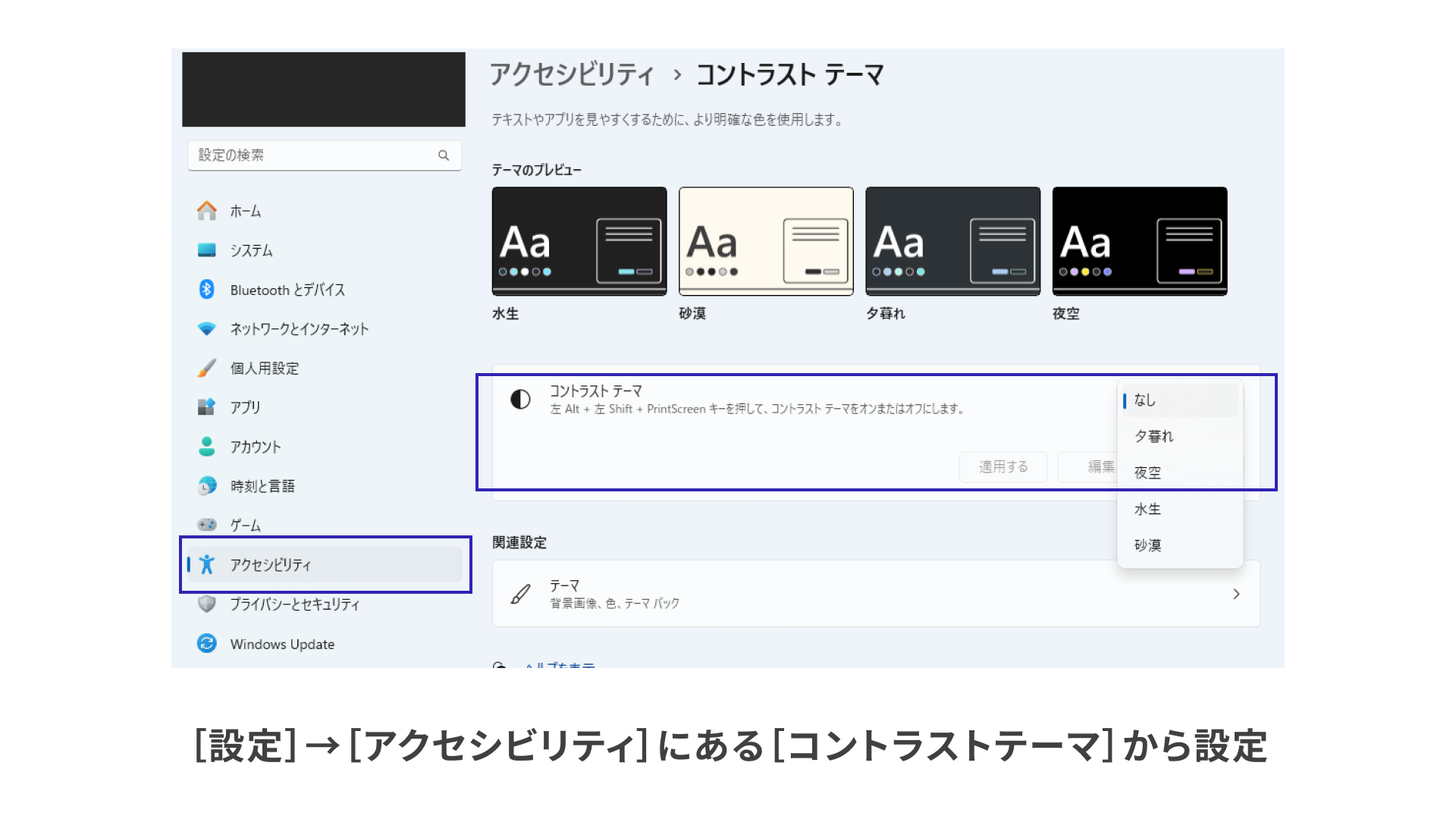
To check forced colors mode in Windows 11, apply a contrast theme from Settings > Accessibility > Contrast themes.
Contrast theme settings in Windows 11
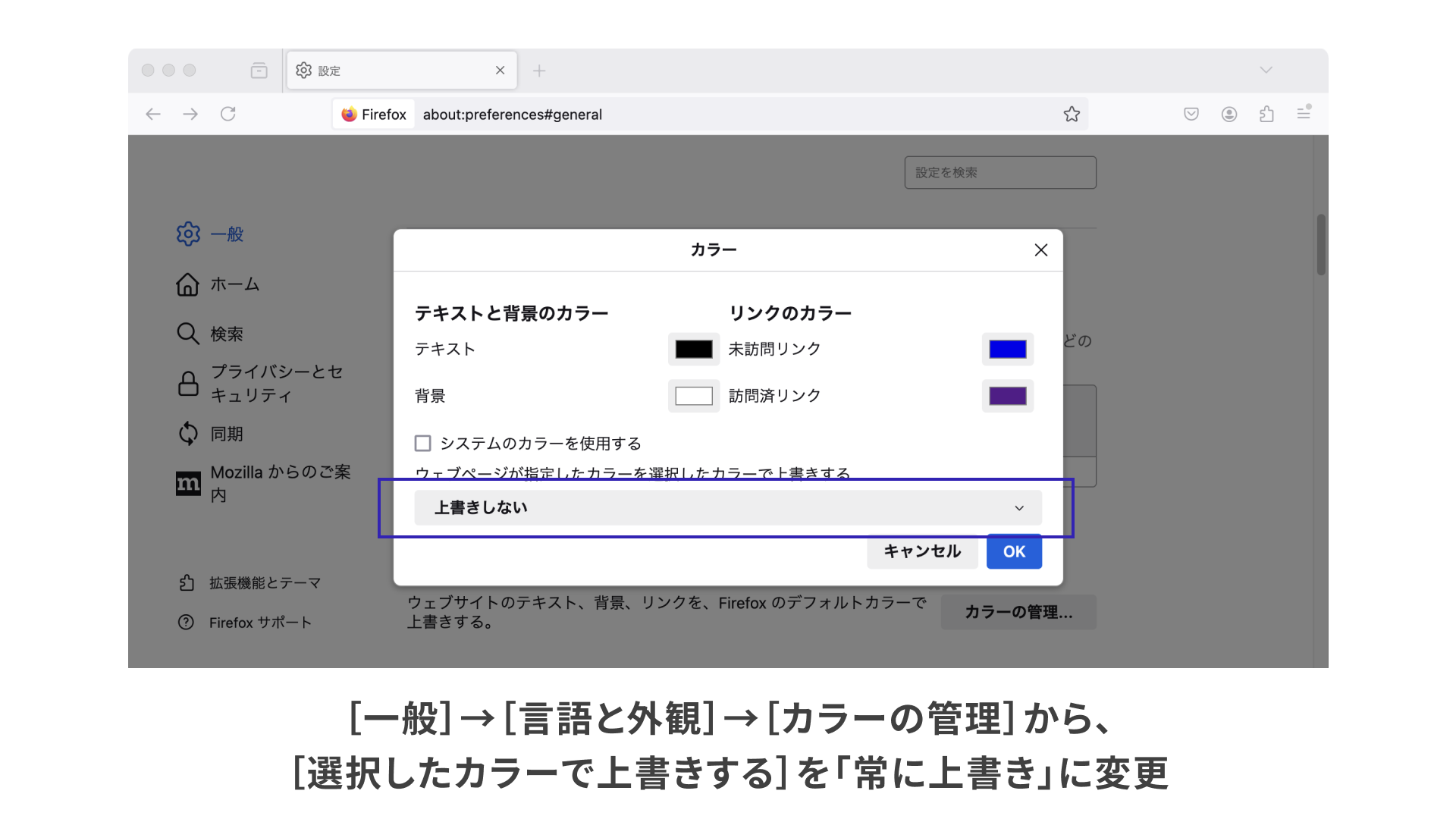
macOS Sonoma 14 does not include a system setting for forced colors mode, but Firefox can emulate it. In Firefox, open Settings and go to General > Language and Appearance > Colors > Manage Colors, then change “Override the colors specified by the page with your selections above” to “Always” to enable forced colors mode.
Steps to emulate forced colors mode in Firefox 129.0.2
Column: use the accent-color property to change only the checked color
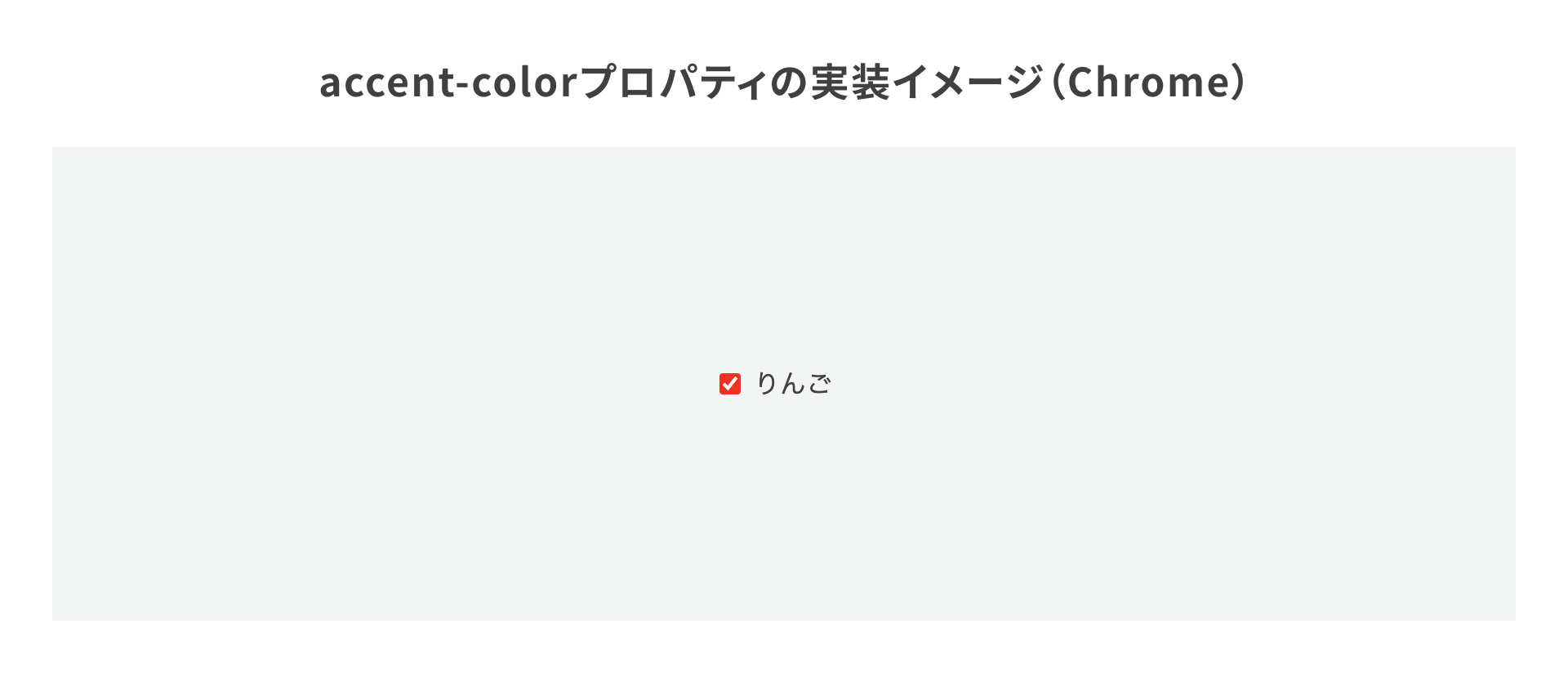
With <input type="checkbox" />, the accent-color property can be used to change the background color when the box is checked. The checkmark color is adjusted automatically based on the accent-color value. This is useful when you want to make basic visual adjustments to the default control without writing custom CSS from scratch.
Implementation example using the accent-color property
<label>
  <input type="checkbox" />
  Apple
</label>
label {
  /* Omitted */
}

input[type="checkbox"] {
  accent-color: red;
}
The initial value of the accent-color property is auto, which uses the browser’s default color. See the MDN page below for details.
Conclusion
This article showed how to implement custom-designed checkboxes.
By creating the icon on the input element itself, you can implement a checkbox without losing the advantages of the standard input element. More complex visual designs may require a different HTML structure than the one introduced here. Even in those cases, keeping these points in mind helps prevent important usability details from being overlooked.