
Have you given up and assumed that “you can’t tighten spacing on the web”? For beautiful typography, many designers consider kerning a basic expectation, and in the worlds of DTP and graphic design, it is one of the foundational techniques.
However, with HTML, you can actually enable automatic kerning simply by specifying CSS’s font-feature-settings property. It is supported by most browsers and is practical enough for real production work. In this article, we will look at the appeal of font-feature-settings and where it is useful.
Key point of this article
Usage is simple. Just set the following property in CSS.
.selector {
  font-feature-settings: "palt";
}
The left side shows the default state, and the right side shows the result after applying the CSS. The text appears tighter and more refined.
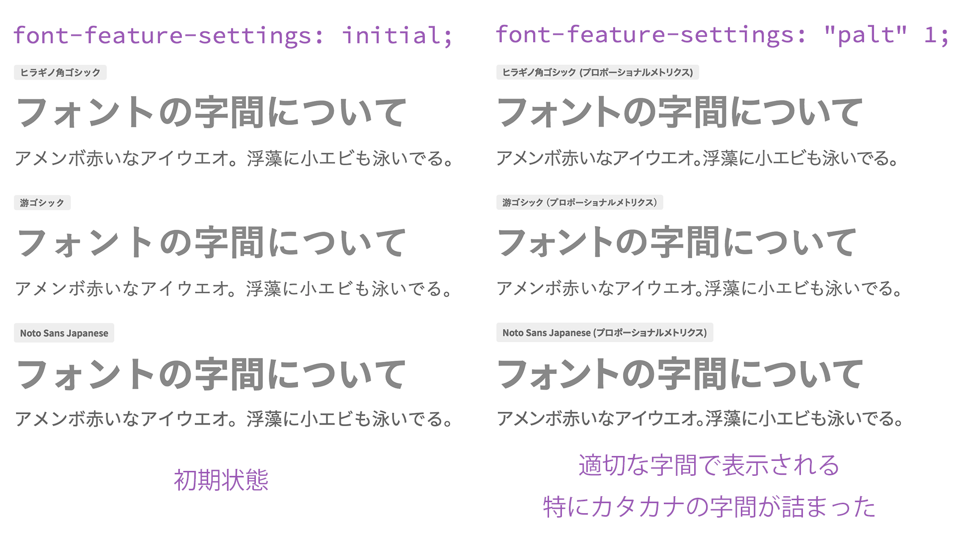
With just this small amount of code, automatic kerning becomes active, and the appearance of Japanese text in HTML becomes dramatically tighter and more polished! Before you rush to say, “I need to use this right now—I’ll copy and paste it immediately,” let’s first deepen our understanding of the basics of Japanese fonts.
Japanese fonts on the web were originally displayed in monospaced widths
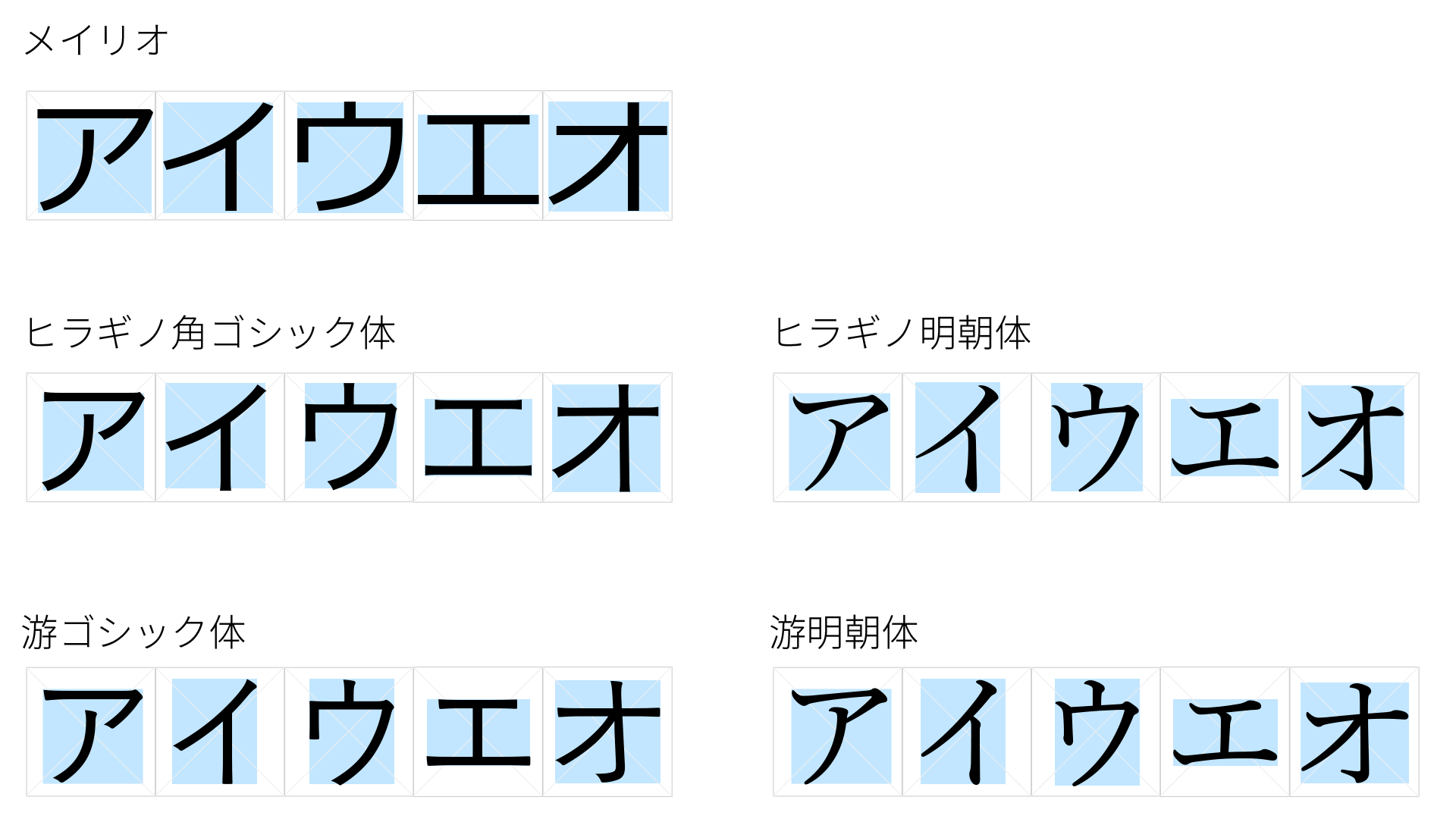
Japanese device fonts specified with font-family often include familiar names such as “Meiryo,” “Hiragino Kaku Gothic,” and “Yu Gothic.” These fonts are a type of OpenType font, designed so that each glyph fits inside a square virtual body.
When you simply type text as-is, OpenType fonts place these squares in sequence, so Japanese text is displayed with uniform character widths. For reference, take a look at the following figure, which compares standard fonts such as “Meiryo,” “Hiragino Kaku Gothic,” and “Yu Gothic.” You can see that the characters are arranged neatly, like the grid on manuscript paper.
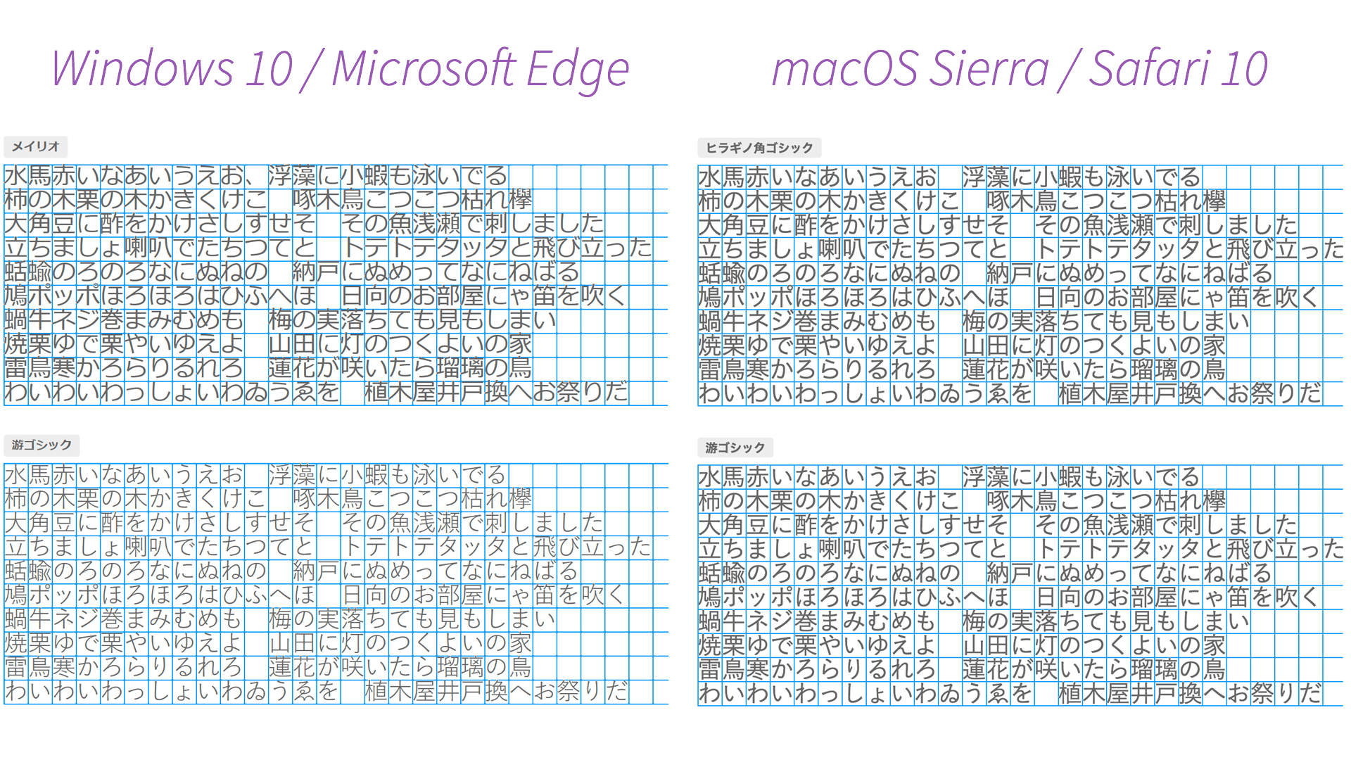
Interestingly, this behavior is especially noticeable on news sites that use full-width alphanumeric characters.
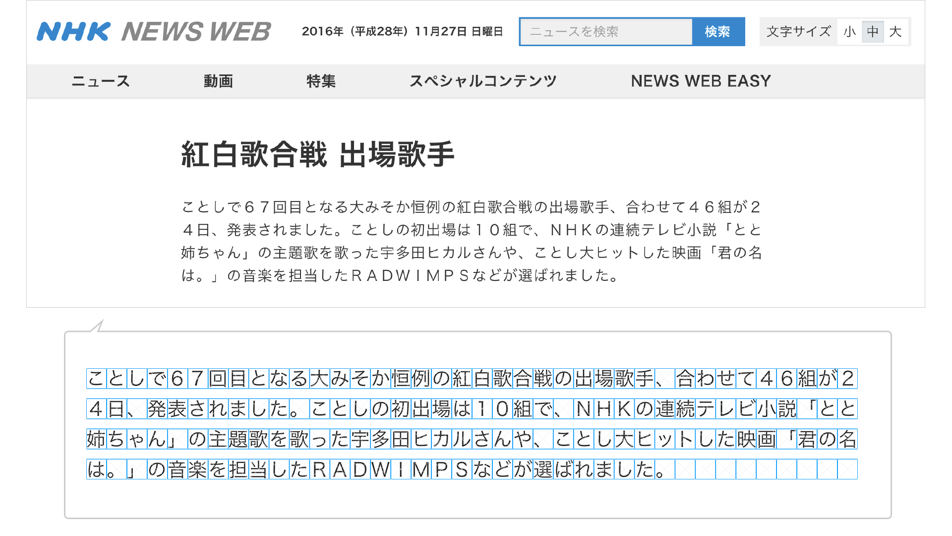
As with the site introduced above, if you are aiming for newspaper-style composition, fixed-width Japanese text may be appropriate. However, until now, monospaced Japanese text was effectively the only option on the web, so even when web designers said, “At least tighten the spacing in the headings!”, HTML coders may have replied, “That’s just how browsers work, so it can’t be done.”
As an exception, older fonts such as “MS PGothic” and “Osaka” are TrueType fonts (TTF) built with proportional widths, so they are displayed proportionally rather than monospaced.
OpenType fonts contain spacing information for kerning
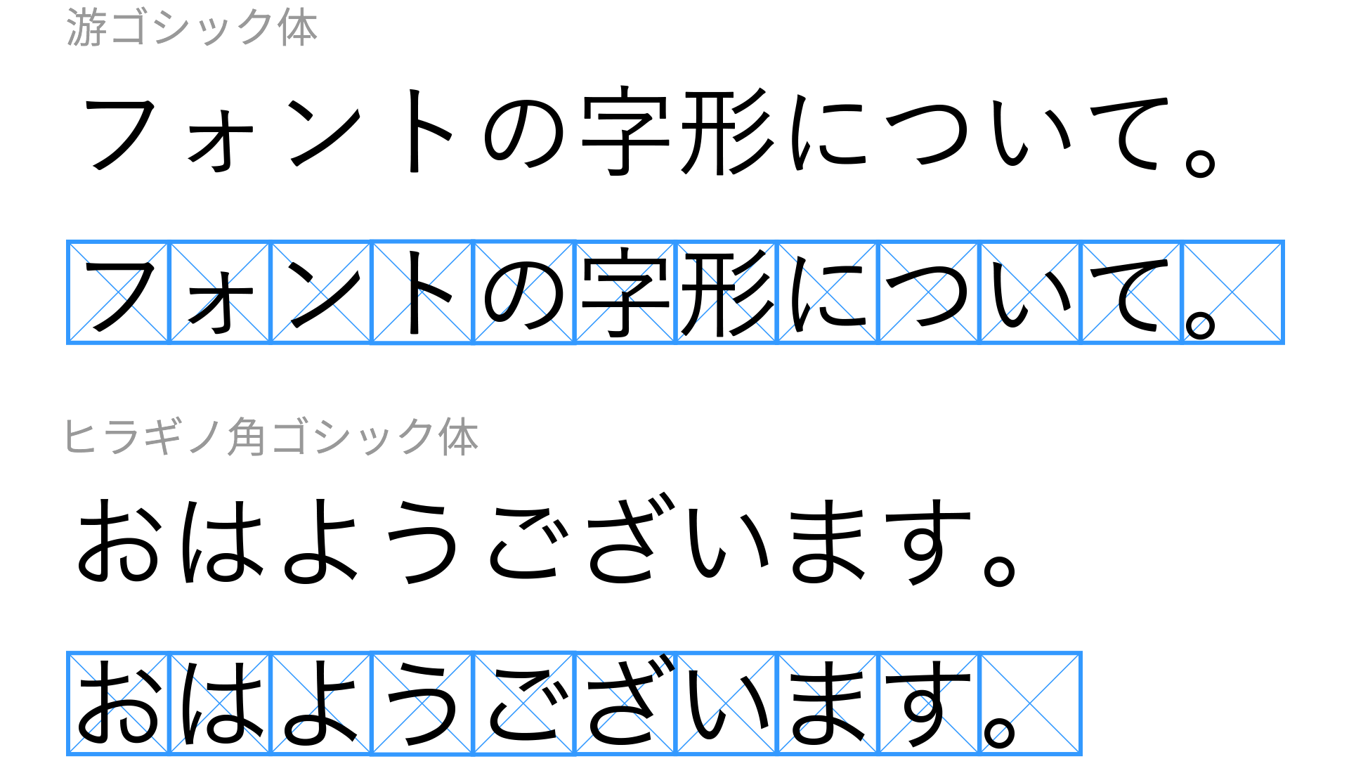
Before discussing CSS, let’s talk briefly about fonts in general. OpenType fonts (OTF) include various optional features for typography. One of these is a feature called proportional metrics, which controls character spacing information within the font. In other words, the optimal spacing defined by the font designer during the design process is built into the OpenType font.
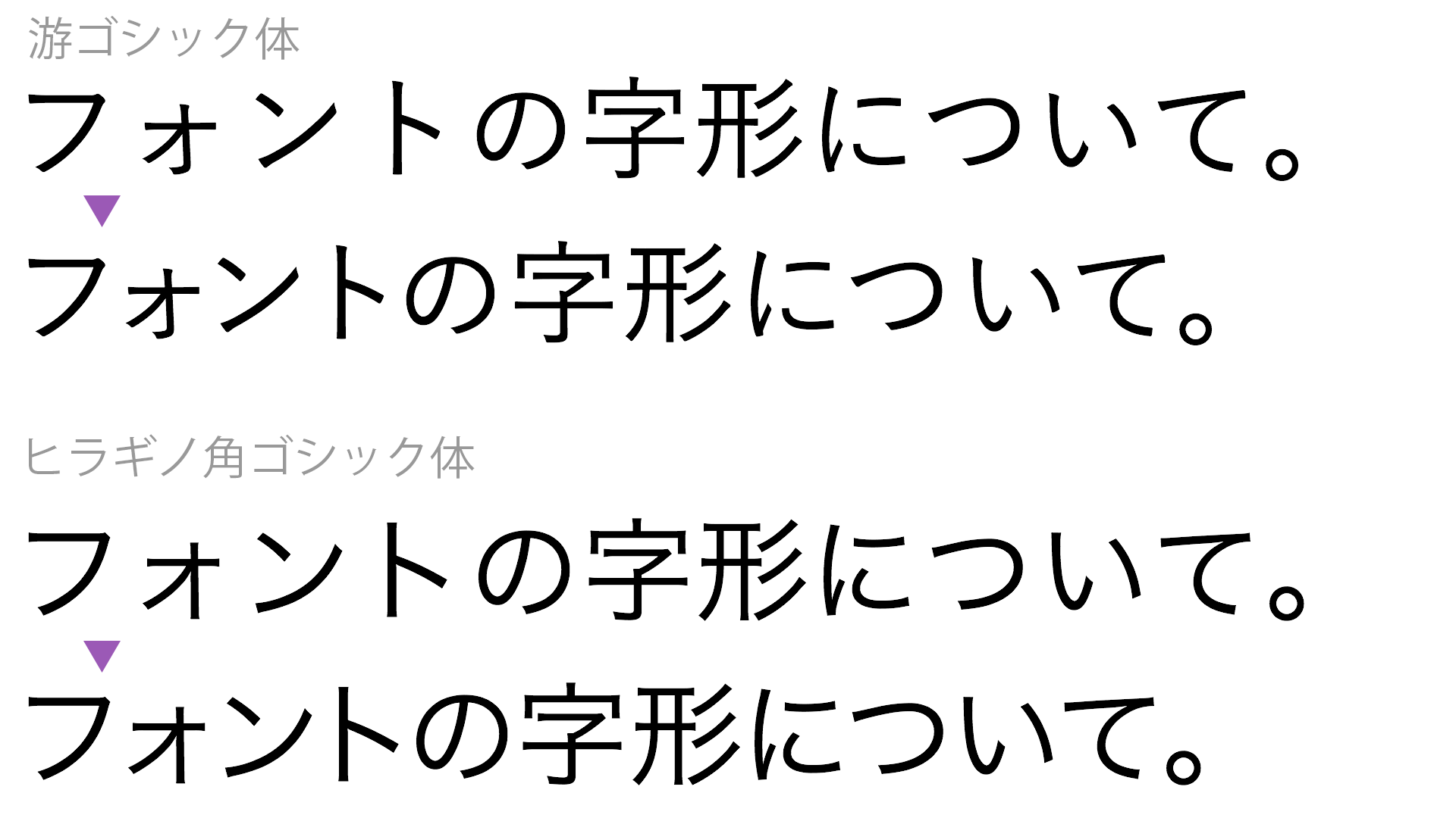
When proportional metrics are enabled, the font’s built-in spacing information is used, so the text becomes tighter, as shown below. In particular, you can clearly see that the katakana characters “ォ” and “ト” are brought closer together.
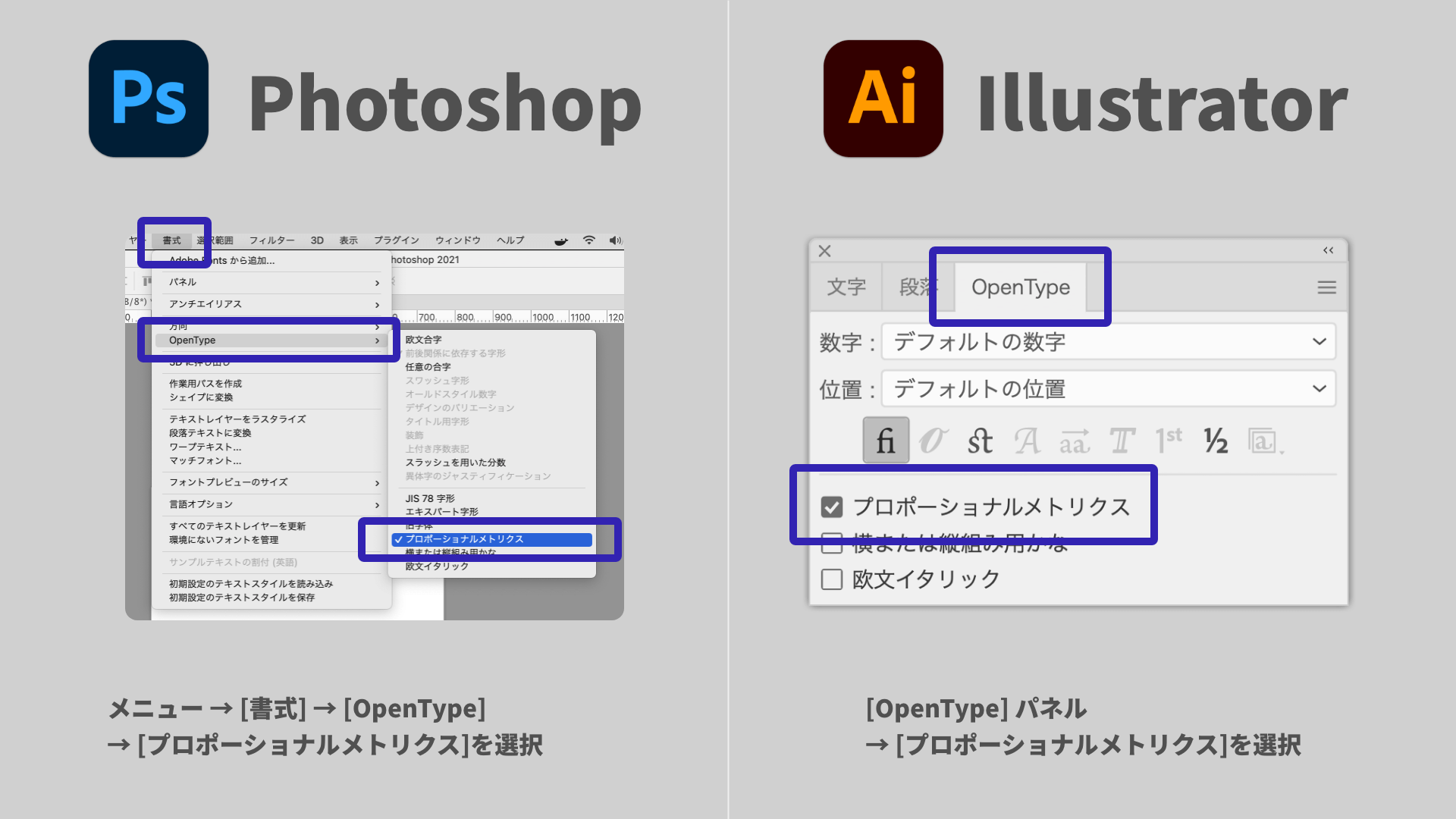
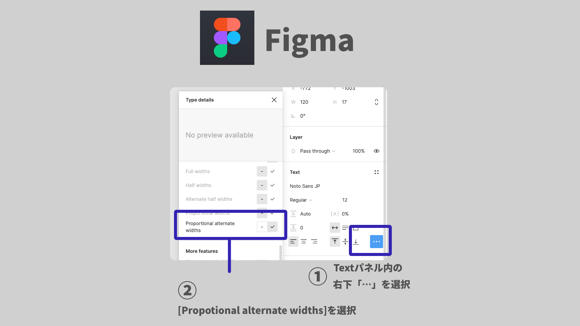
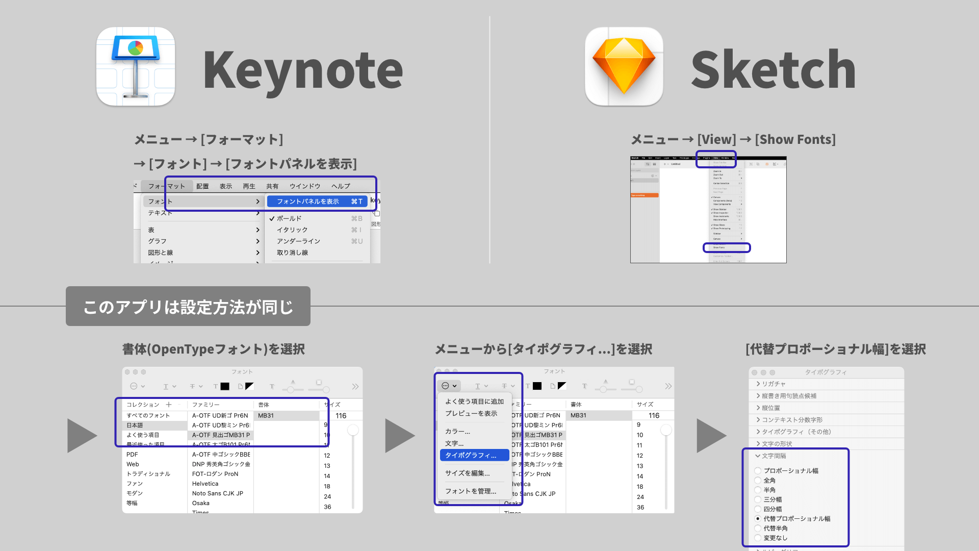
As a side note, because proportional metrics are an OpenType feature, they can be used anywhere the software supports them. For example, you can enable proportional metrics in Adobe Photoshop, Illustrator, Figma, and Apple Keynote.
Now that we have a better understanding of Japanese fonts, let’s move on to kerning in HTML.
Enable OpenType optional features with font-feature-settings
CSS’s font-feature-settings is a property used to specify optional OpenType features. To enable proportional metrics, use palt. palt is short for Proportional Alternate Widths.
The font-feature-settings property is specified as a pair of a feature name and an enabled/disabled value (0 or 1, or off or on). If 1 (enabled) is omitted, it is treated as 1, so the feature is enabled.
.selector {
  /* Enable proportional metrics */
  font-feature-settings: "palt" 1;
}
When punctuation becomes too tight
If palt makes punctuation feel too compressed and harder to read, you may want to use alternative values such as pwid (replace with proportional-width glyphs) or pkna (replace kana and kana-related glyphs with proportional-width variants). Which value is best depends on the font and the overall tone of the site.
Also, the ideal spacing varies depending on font size and layout, so proportional spacing is not always the one correct answer. If the text feels too tight, it may be worth adjusting it further with letter-spacing.
Multiple features can also be specified
If you want to enable multiple optional features, separate them with commas. For example, the following code enables both proportional metrics and traditional forms.
.selector {
  /* Enable proportional metrics and traditional forms */
  font-feature-settings: "palt" 1, "trad" 1;
}
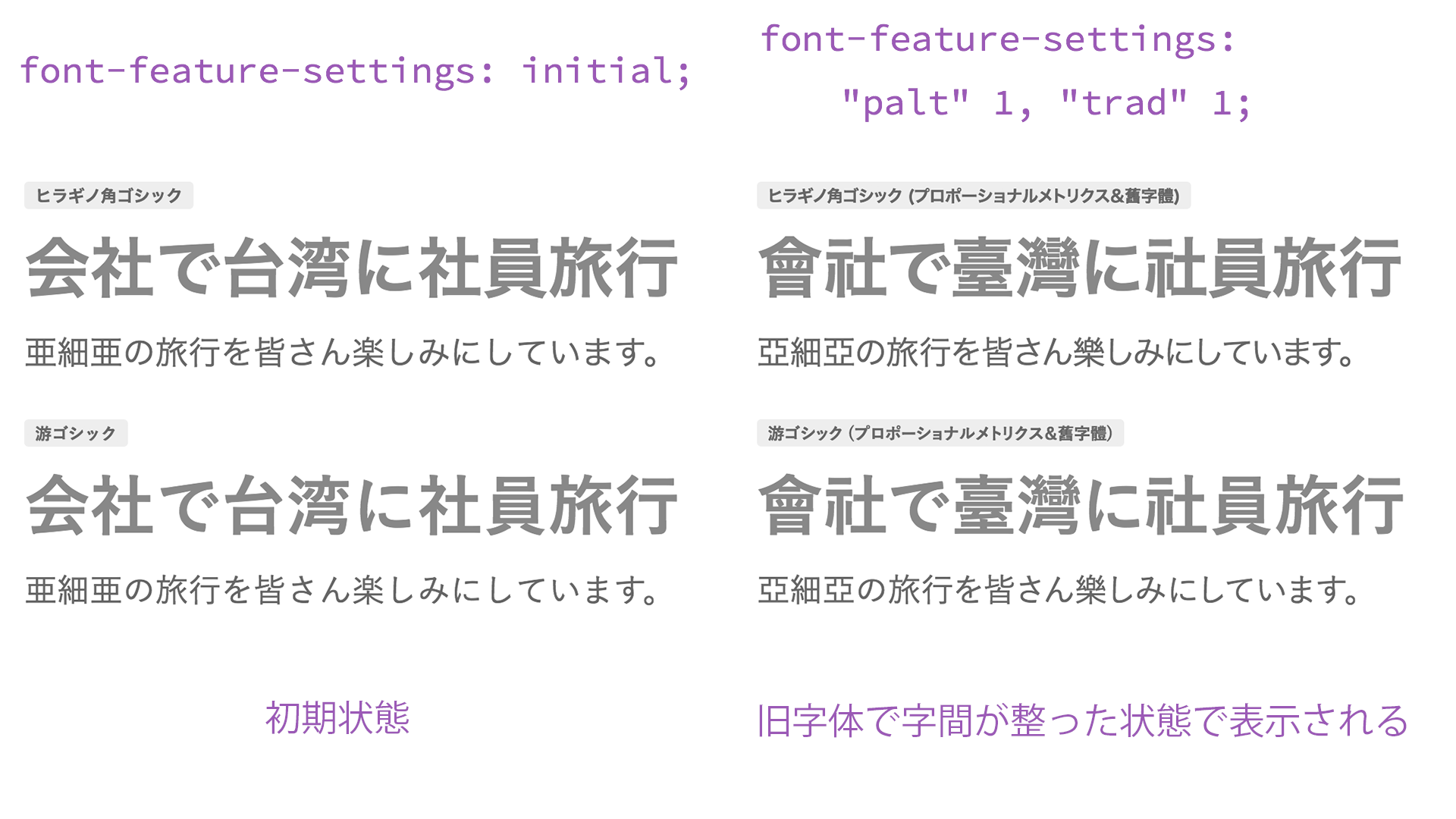
▲ Specifying trad displays traditional character forms. It feels like prewar Japan!
Plenty of interesting features beyond automatic kerning
OpenType fonts offer many options beyond proportional metrics. For example, let’s try swashes and ligatures.
.font-swash {
  /* Enable swashes */
  font-feature-settings: "swsh" 1;
}

.font-liga {
  /* Enable discretionary ligatures */
  font-variant-ligatures: common-ligatures;
  font-feature-settings: "dlig" 1;
}
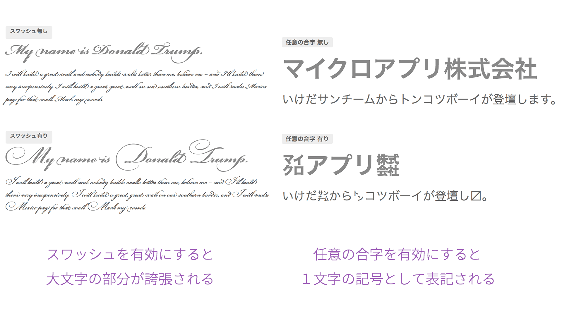
▲ Specifying swashes with swsh gives cursive text a striking flourish, while specifying discretionary ligatures with dlig causes letters to combine. Typography is fun to experiment with!
For the various optional features available through font-feature-settings, Adobe’s “Syntax for OpenType features in CSS” is a useful reference. Once you get comfortable with them, they greatly expand the freedom of typography and can support a wide range of design work.
Fonts that support proportional metrics
Using this CSS property does not mean that automatic kerning will work with every font. Two conditions must be met: the font must be an OpenType font, and it must include proportional metrics information. Among representative fonts, “Hiragino Kaku Gothic,” “Hiragino Mincho,” “Yu Gothic,” “Yu Mincho,” and “Noto Sans CJK JP” all support this.
“Meiryo,” which is very familiar in Windows environments, was designed with fixed-width Japanese glyphs, so it does not include proportional metrics information. Therefore, applying proportional metrics to “Meiryo” will not tighten character spacing.
| Font name | Font type | Character spacing |
|---|---|---|
| MS PGothic | TrueType | Proportional |
| MS PMincho | TrueType | Proportional |
| Meiryo | OpenType | Monospaced |
| Osaka | TrueType | Proportional |
| Hiragino Kaku Gothic | OpenType | Includes proportional metrics |
| Hiragino Mincho | OpenType | Includes proportional metrics |
| Yu Gothic | OpenType | Includes proportional metrics |
| Yu Mincho | OpenType | Includes proportional metrics |
| Noto Sans CJK JP | OpenType | Includes proportional metrics |
Proportional metrics are especially effective with Yu Gothic
Yu Gothic, included with both Windows and macOS, is designed with kana that are noticeably smaller relative to kanji. Because Yu Gothic tends to look more loosely spaced than Hiragino, making use of proportional metrics can have a particularly strong effect.
Proportional metrics are also effective with web fonts
This is not limited to device fonts. Many OpenType web fonts also support proportional metrics. For web fonts, please refer to the article “Webフォントサービスの徹底比較! 和文フォントが使える5つのサービスの利点まとめ.”
▲ On the left, no setting is applied (monospaced Japanese text), so the katakana feels widely spaced. On the right, proportional glyphs are applied, so the katakana is tighter.
Browser support: available in nearly all browsers
font-feature-settings is supported by all current modern browsers (see “Can I use…”).
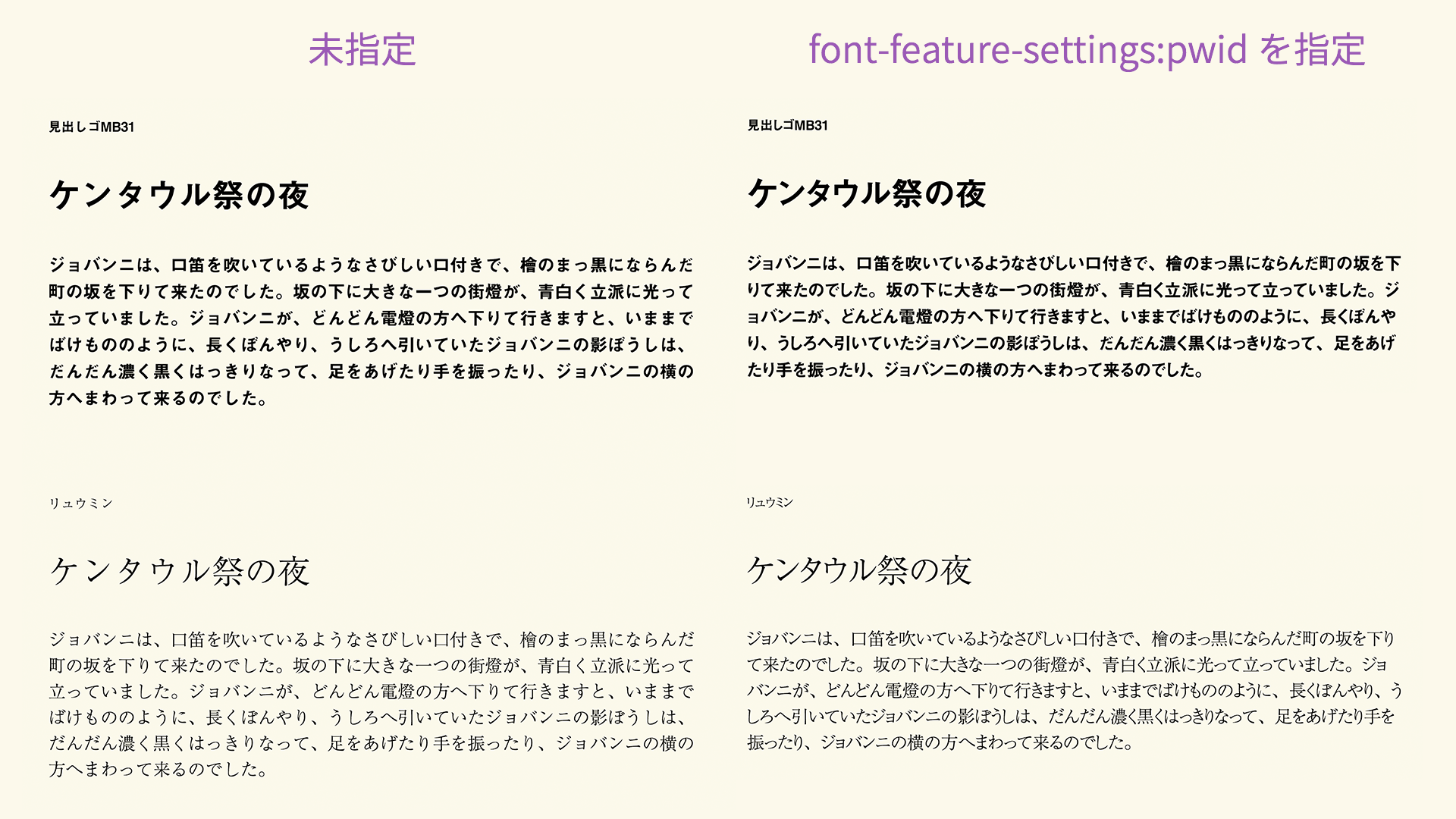
The difference between font-variant and font-feature-settings
What this article explains with font-feature-settings can also be done with CSS’s font-variant-related properties. The font-variant family provides a higher-level way to specify these features than font-feature-settings, allowing simpler syntax.
For example, the following two declarations both produce the same result for proportional-width glyphs.
.selector1 {
  /* Enable proportional-width glyphs */
  font-feature-settings: "pwid" 1;
}

.selector2 {
  /* Enable proportional-width glyphs */
  font-variant-east-asian: proportional-width;
}
For details, see the article “フォントをもっと自由に! CSSのfont-variant活用術.”
However, the proportional metrics setting introduced in this article can only be specified with font-feature-settings: "palt". The font-variant-east-asian property corresponds to font-feature-settings: "pwid" (proportional-width glyphs). palt and pwid are similar, but they are different features.
Conclusion
Traditionally, when designers wanted precise kerning, they would apply CSS letter-spacing character by character (see the reference article “HTMLでカーニング!手軽に文字詰めできる「FLAutoKerning.js」 | 株式会社LIG(リグ)”). This approach, which analyzes strings with JavaScript and adjusts them with CSS, can achieve highly precise kerning, but relatively few sites were likely using it.
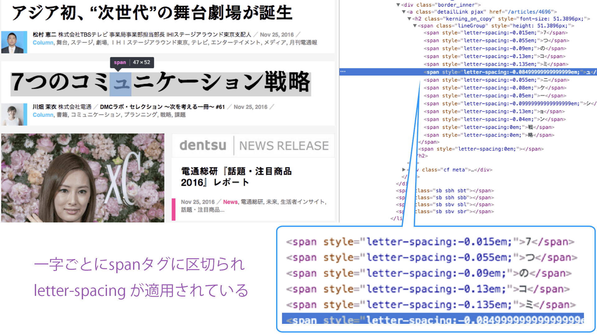
▲ As an example of a site with strong attention to typography, “Dentsu-ho” breaks text into individual elements and applies character spacing information to each one
In contrast, CSS’s font-feature-settings property is simple and takes advantage of the strengths of OpenType fonts. Front-end engineers with enough confidence in their skills may even want to combine both approaches to pursue perfect kerning. font-feature-settings and letter-spacing can be used together.
Whether or not to apply kerning should be considered in relation to the overall feel of the site, but web design now has a new option beyond fixed-width Japanese text. If using it in body text feels too impactful, you might start by applying it only to headings. Why not start using font-feature-settings yourself?